BRANDING


Concept & Strategy
The name "Kai" holds multiple meanings across languages—sea, triumph, joy, order, and food. This richness inspired a brand identity that feels fluid, community-centered, and emotionally resonant. The visual language draws from the sea: smooth, organic lines create a sense of movement and harmony across every application.
VISUAL IDENTITY
Logo Design
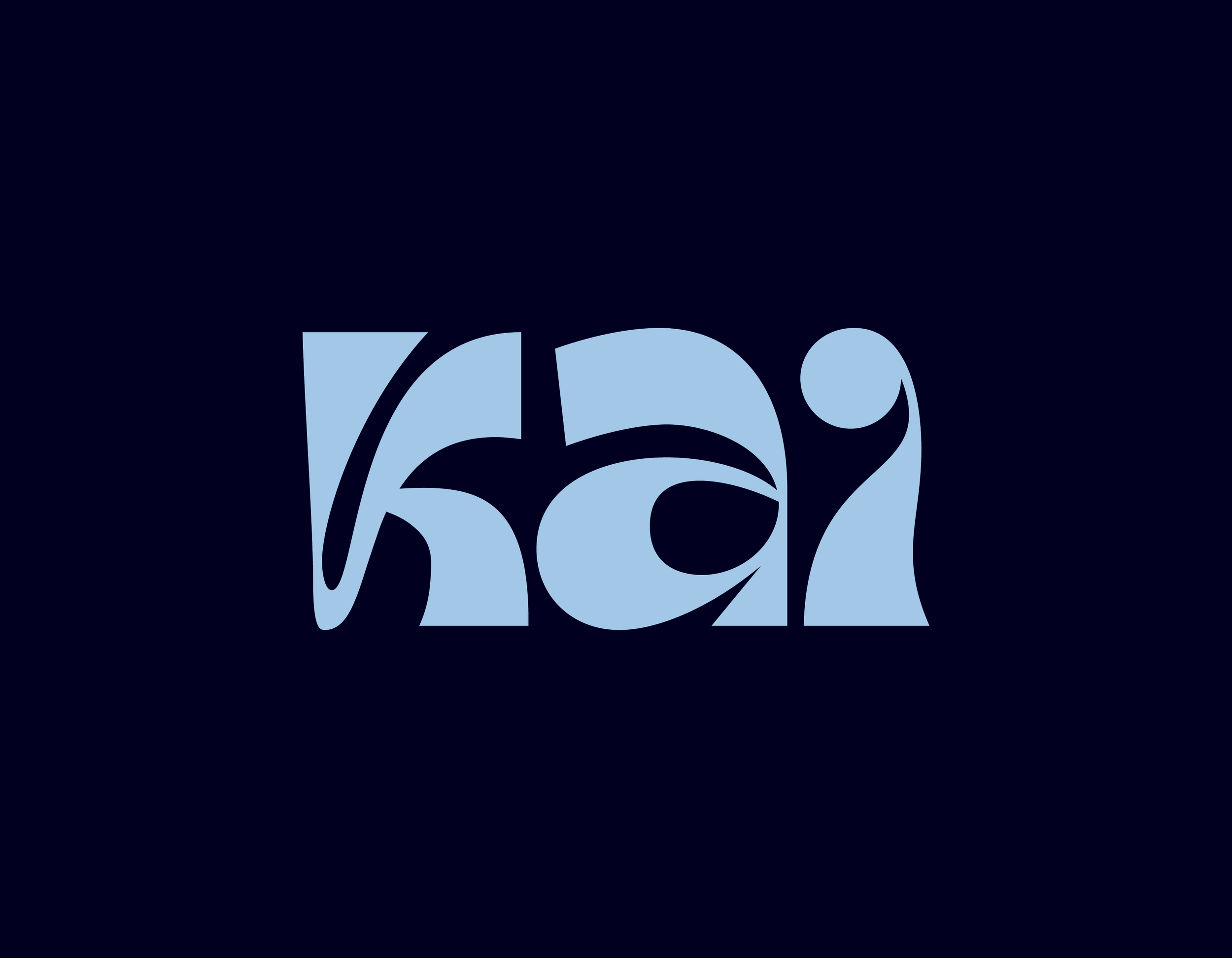
Primary Logo – Kai Wordmark
The logo utilizes a customized version of the Tanamera typeface, chosen for its fluid character and resemblance to the undulating motion of the sea. The curves of the letters were modified to emphasize this maritime inspiration, resulting in a logotype that feels light, welcoming, and elegant.


Secondary Mark – The "K" Icon
The secondary mark is a refined version of the letter “K” from the Kai wordmark. It was adapted to function as a standalone icon, ideal for digital profiles, stickers, signage, or packaging stamps. With its soft, curved lines, the symbol retains the brand’s visual DNA while offering a flexible and memorable shorthand for Kai’s identity.
Color Palette
Kai’s color system reflects its essence: fluidity, warmth, and a deep sense of community. Inspired by the sea and the quality of its offerings, the palette combines cool, serene tones with earthy, inviting hues. Each color was carefully selected to reflect the diverse meanings behind the name Kai.


Iconography
Custom, hand-illustrated icons add a human, artisanal touch to the brand. Inspired by the brand’s multilingual meanings, the icons feature soft shapes and fluid lines that express the ideas of sea, joy, nourishment, and balance.
