REBRANDING


Concept & Strategy
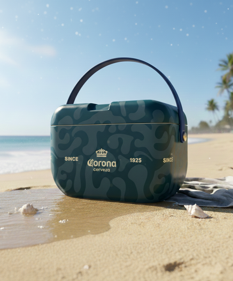
The name On The Move reflects the essence of a brand that is constantly in motion—growing, playing, exploring, and creating. Inspired by childhood as a space of discovery and imagination, the brand embraces movement as a symbol of freedom, curiosity, and joy.
Rooted in a strong connection to art and education, On The Move understands clothing as an extension of play: a way to express creativity, to dream, and to turn everyday moments into something magical. Guided by the idea that getting dressed can also be a game, the brand builds a playful and expressive universe where comfort, imagination, and fun come together naturally.
VISUAL IDENTITY
Logo Design
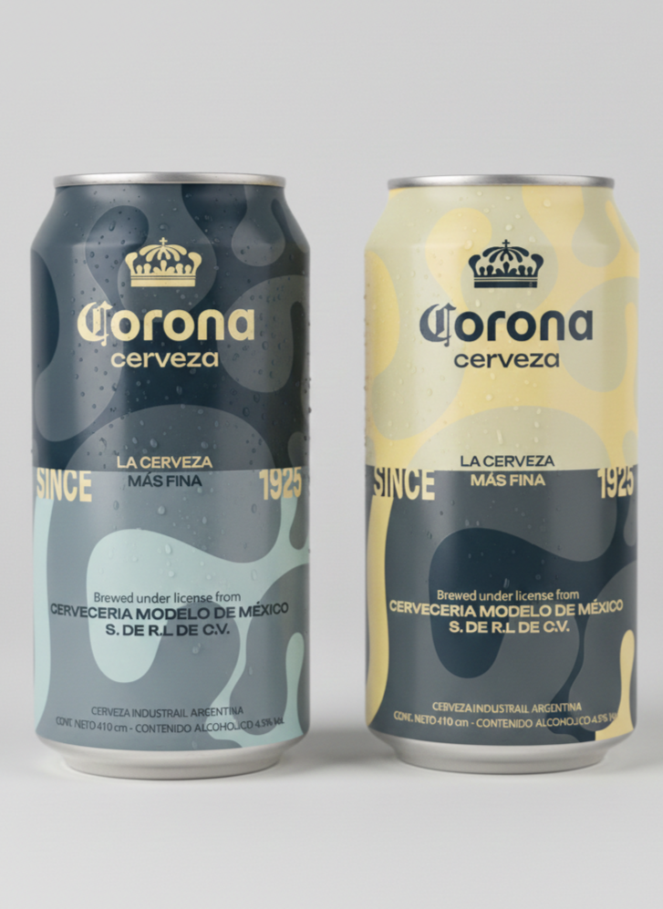
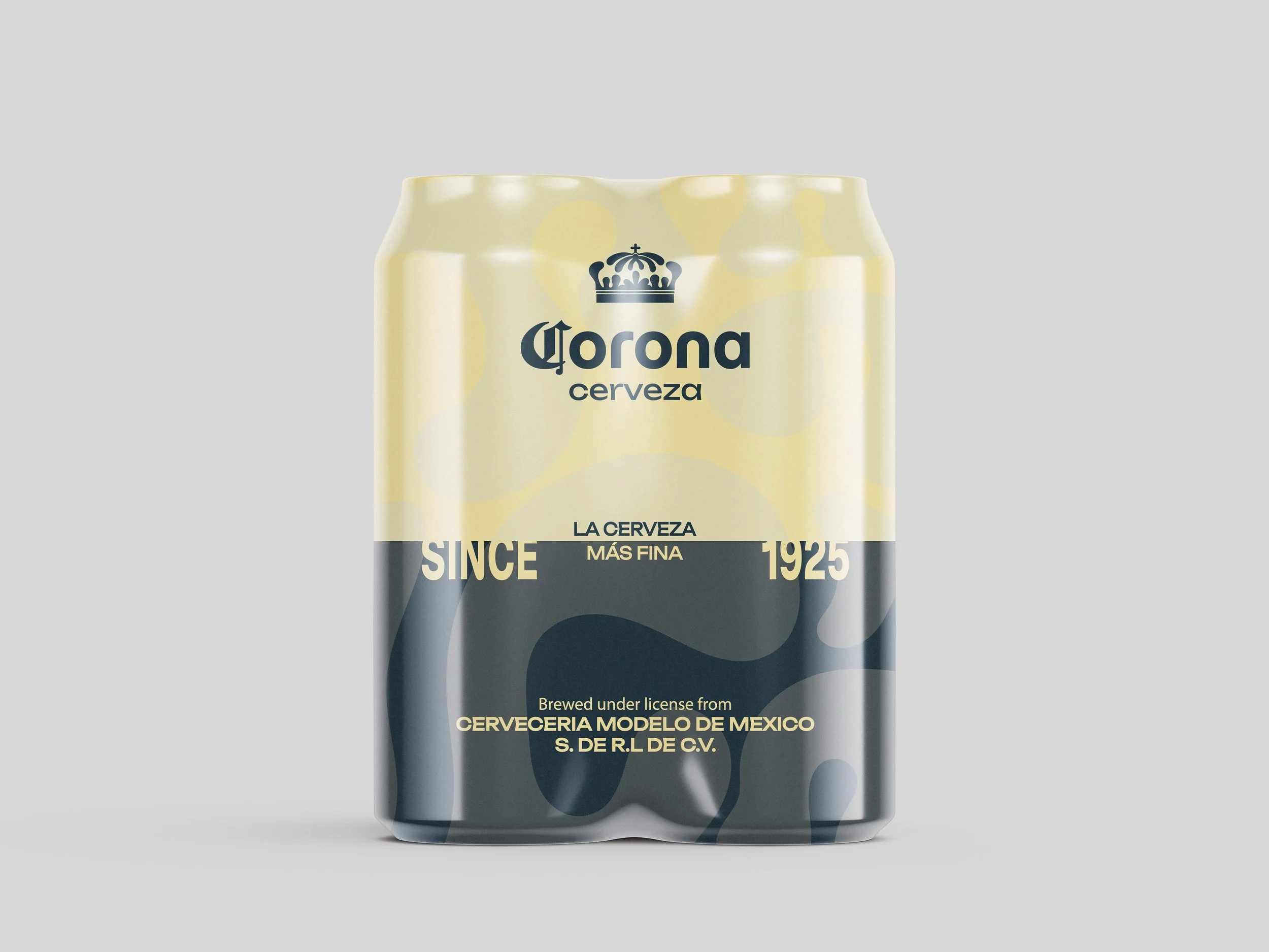
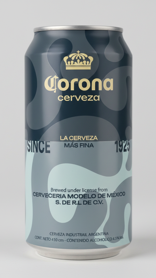
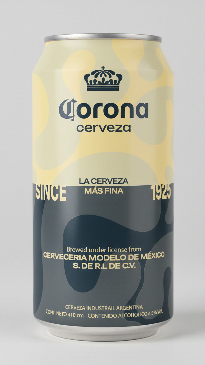
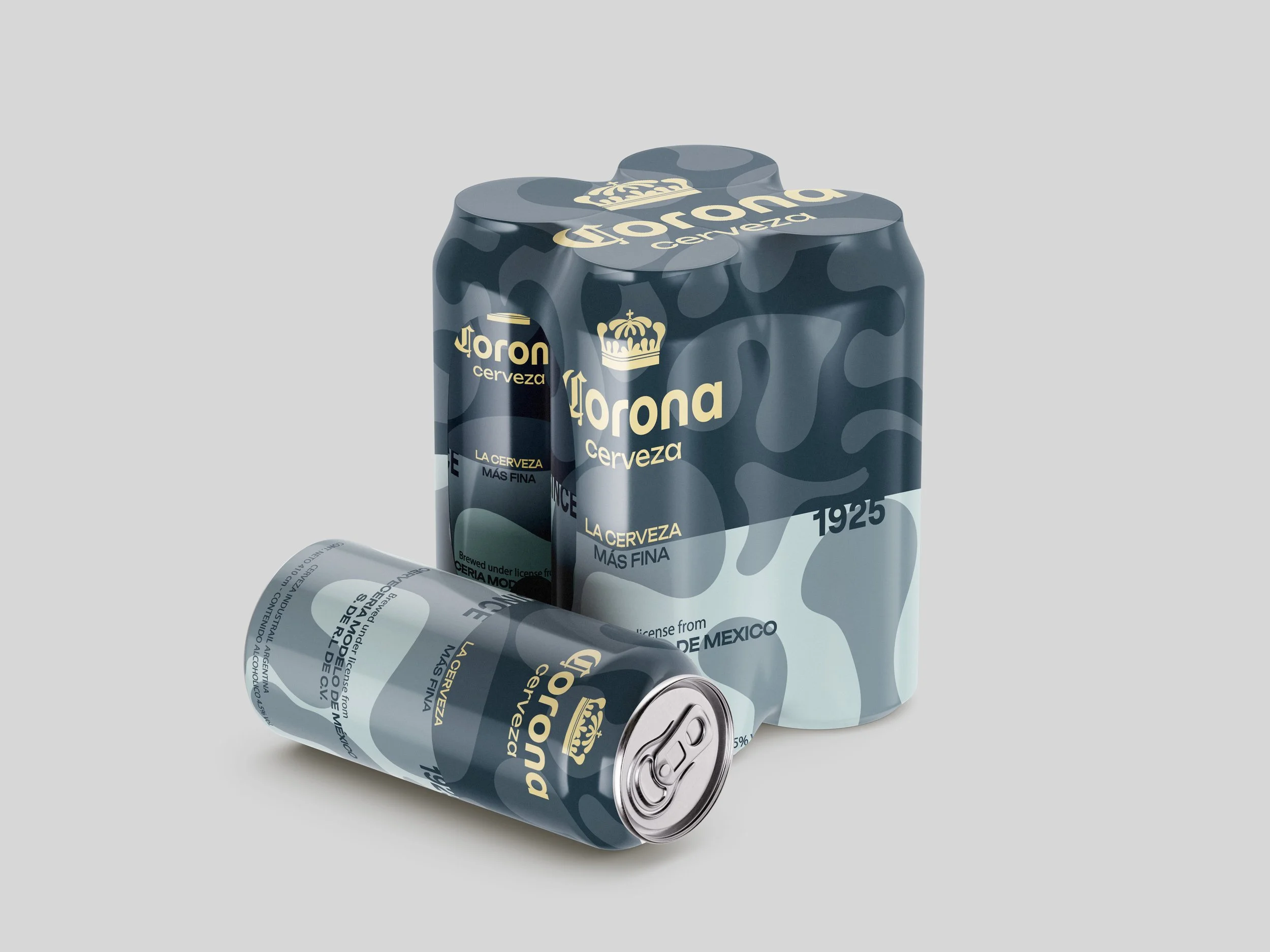
Primary Logo – Corona
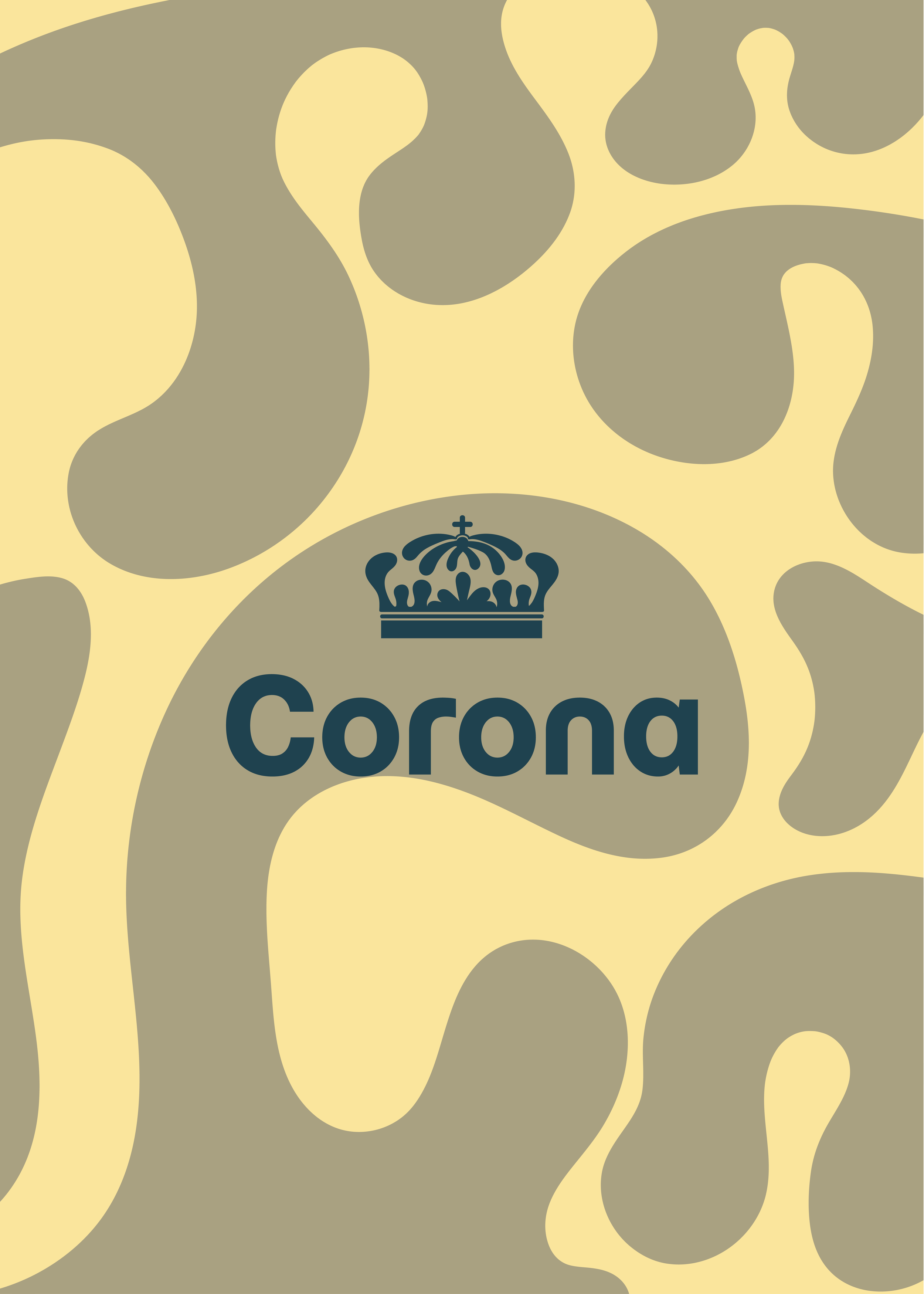
For the full logo, I decided to preserve Corona’s iconic “C” as a way to maintain brand recognition and visual heritage. The rest of the wordmark was redesigned using the typeface “Momo Trust Display”, creating a more contemporary and refined balance while still respecting the brand’s identity.
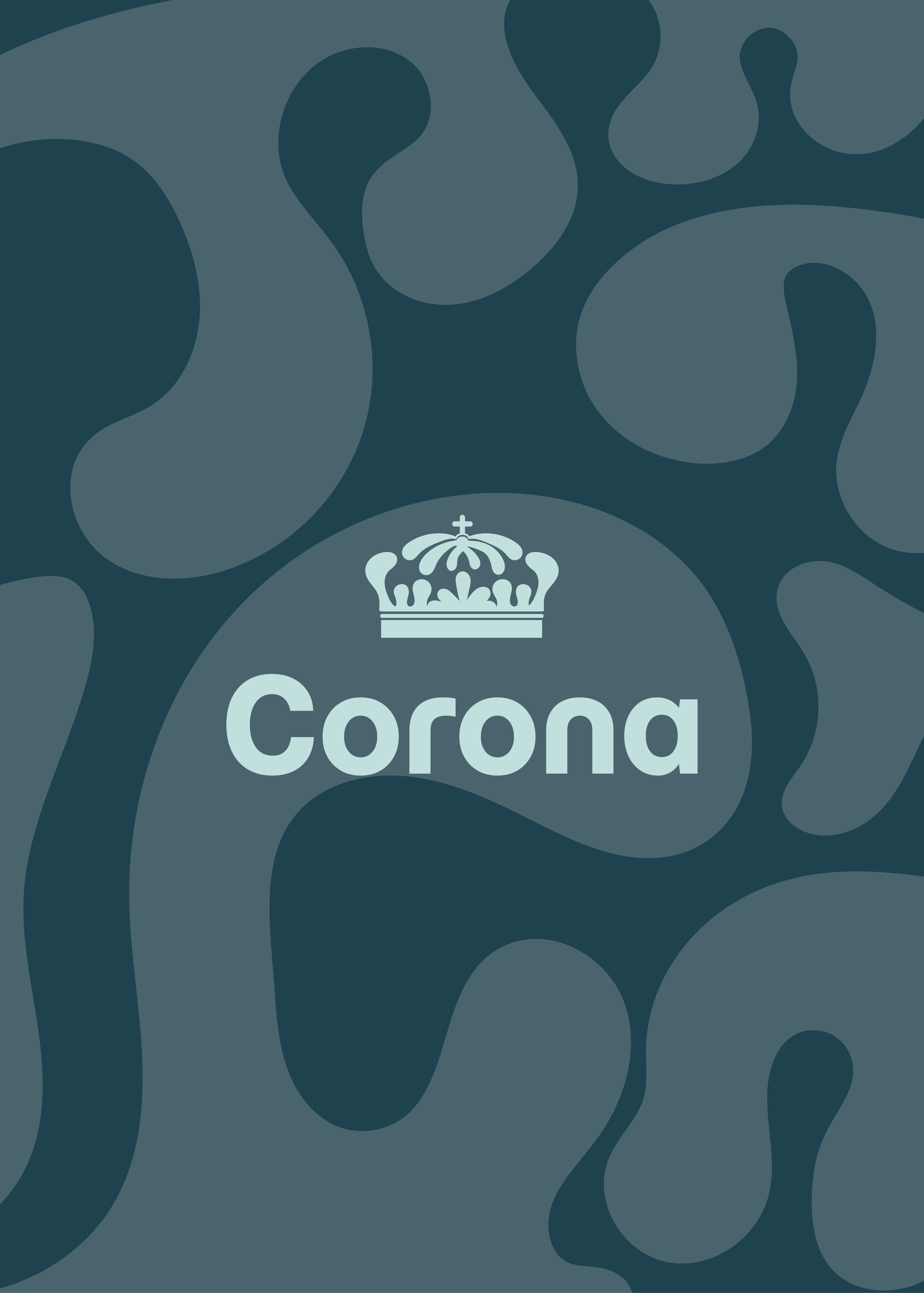
I also kept the crown as the main symbol of the brand. However, instead of replicating the original, I illustrated a new crown from scratch.
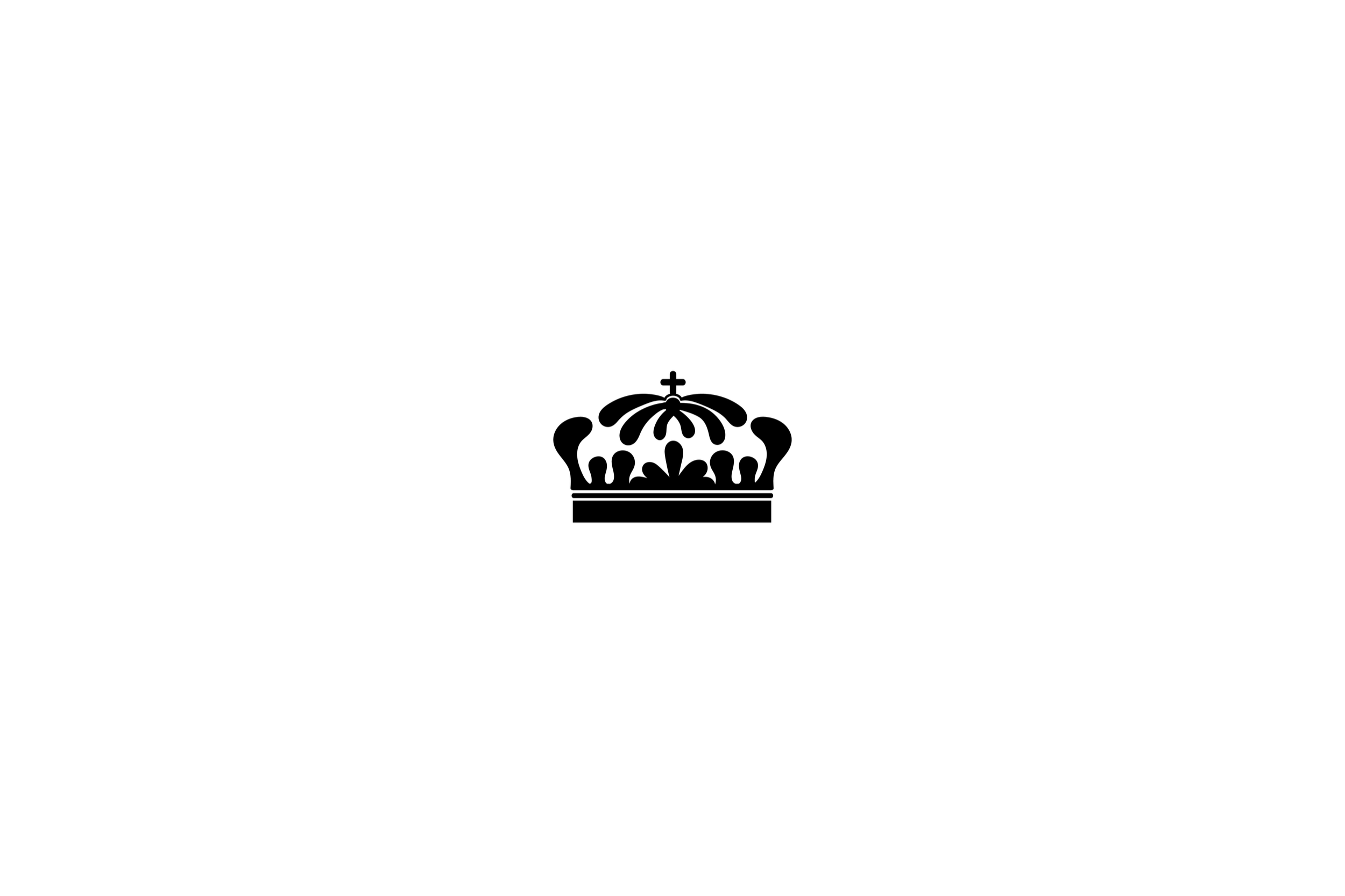
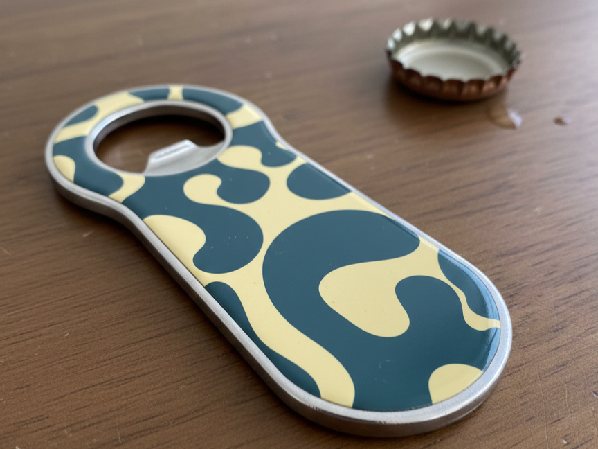
Secondary Mark – The " Crown" Icon
I focused on redesigning the crown as an independent visual element. Instead of using the existing one, I created a new illustrated crown inspired by the original design.
The goal was to preserve its recognizable structure and meaning while refining the details and proportions. By simplifying and re-illustrating the crown, I achieved a more cohesive, modern, and versatile symbol that works effectively across different applications.