BRANDING


Concept & Strategy
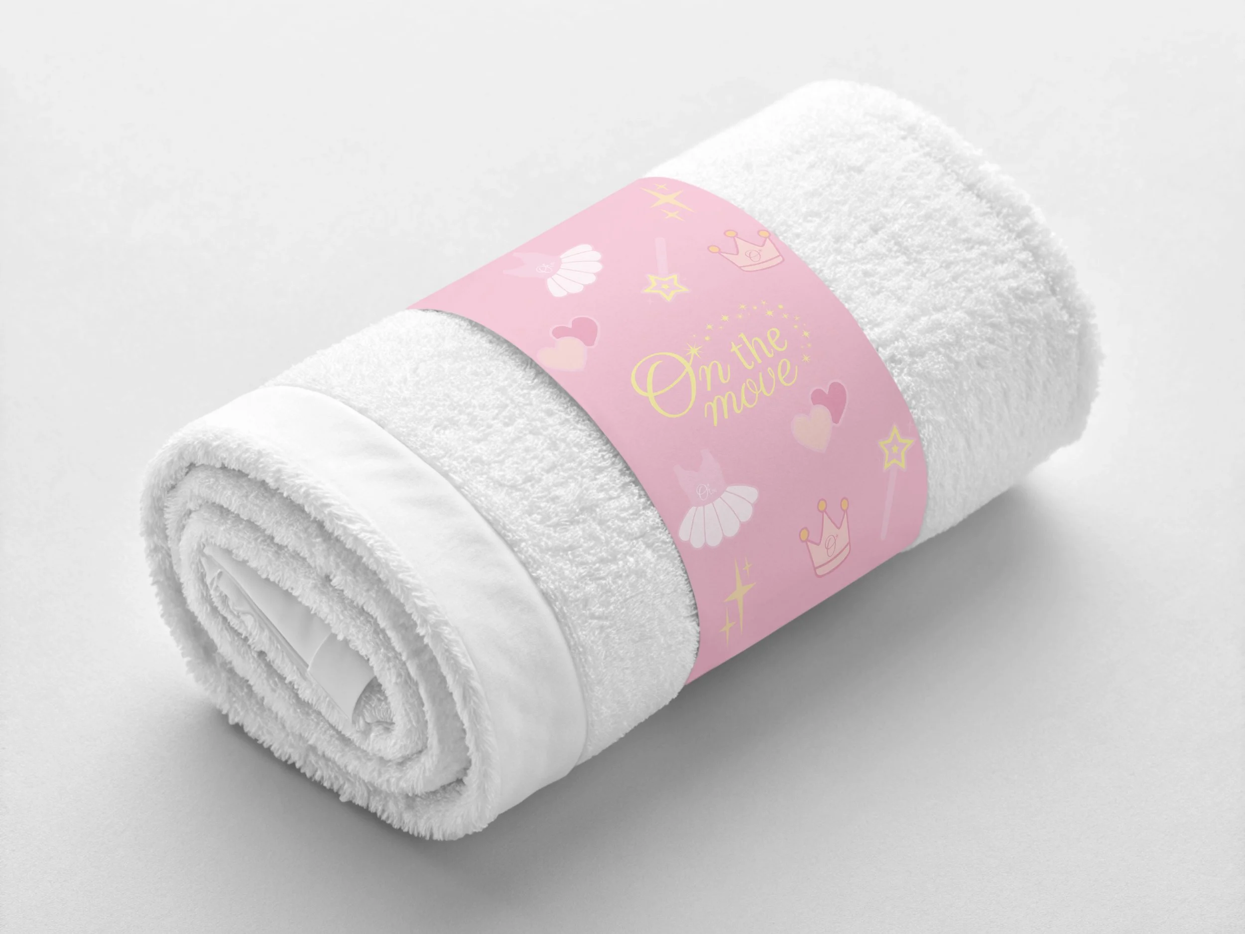
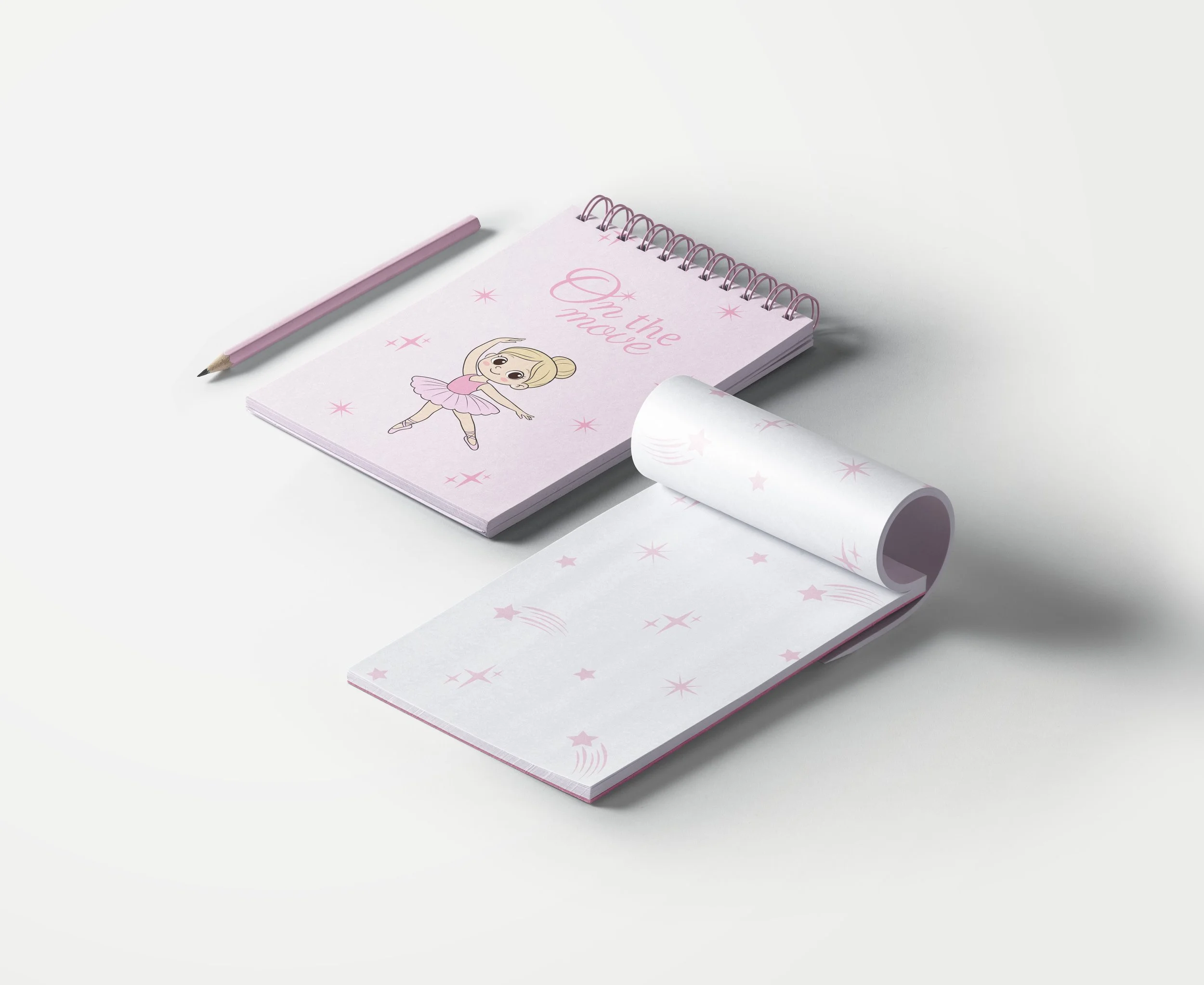
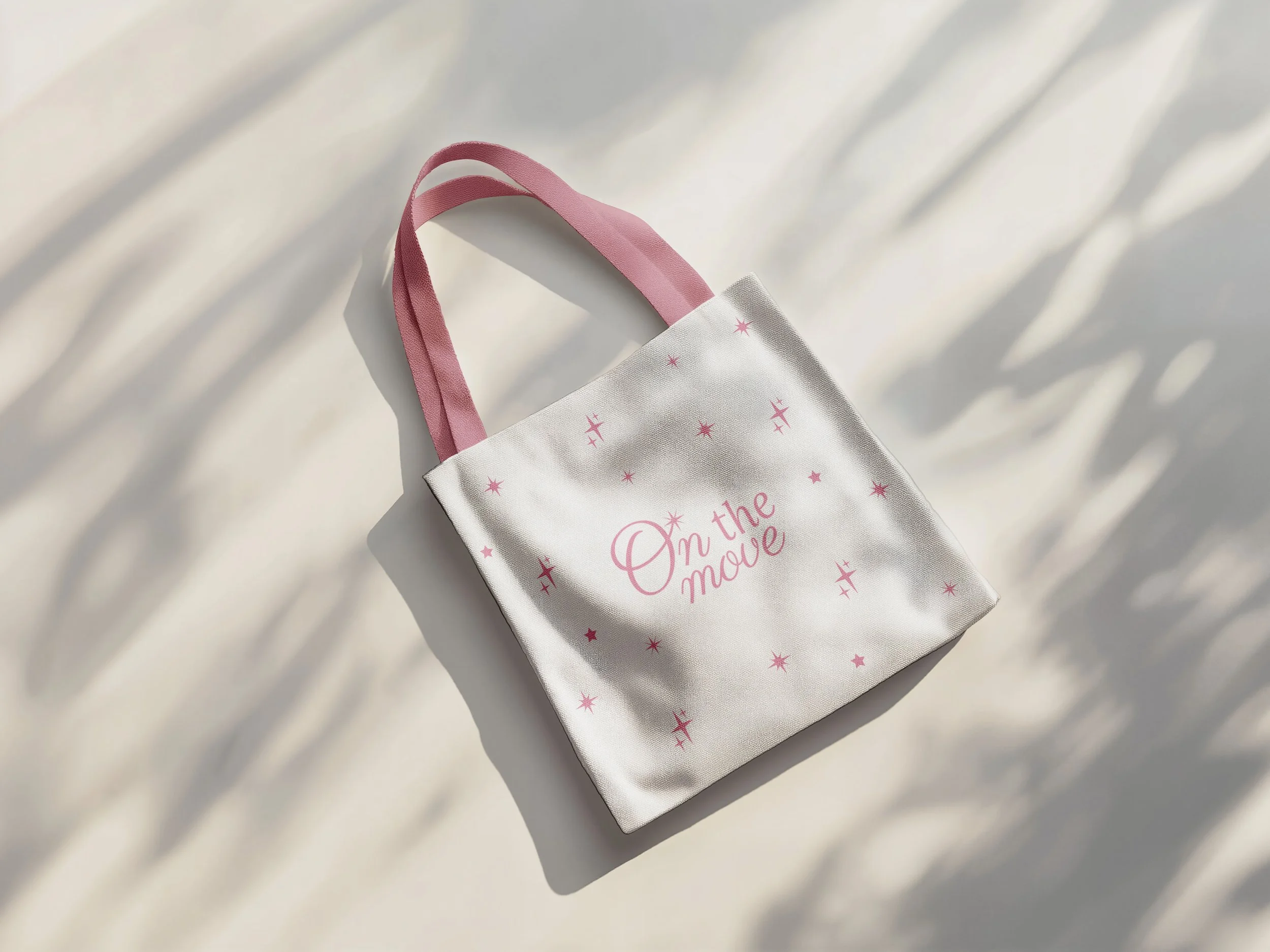
The name On The Move reflects the essence of a brand that is constantly in motion—growing, playing, exploring, and creating. Inspired by childhood as a space of discovery and imagination, the brand embraces movement as a symbol of freedom, curiosity, and joy.
Rooted in a strong connection to art and education, On The Move understands clothing as an extension of play: a way to express creativity, to dream, and to turn everyday moments into something magical. Guided by the idea that getting dressed can also be a game, the brand builds a playful and expressive universe where comfort, imagination, and fun come together naturally.
VISUAL IDENTITY
Logo Design
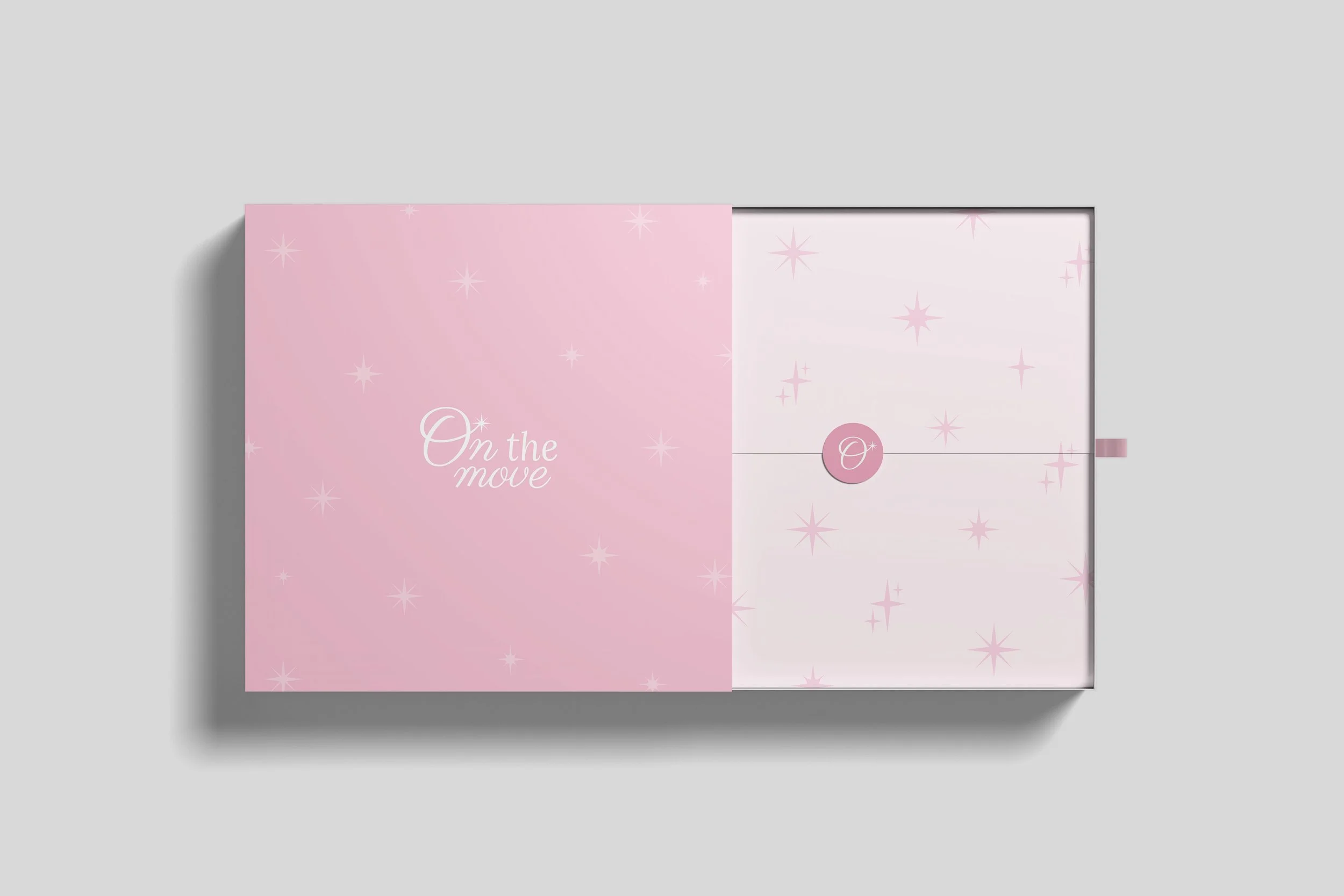
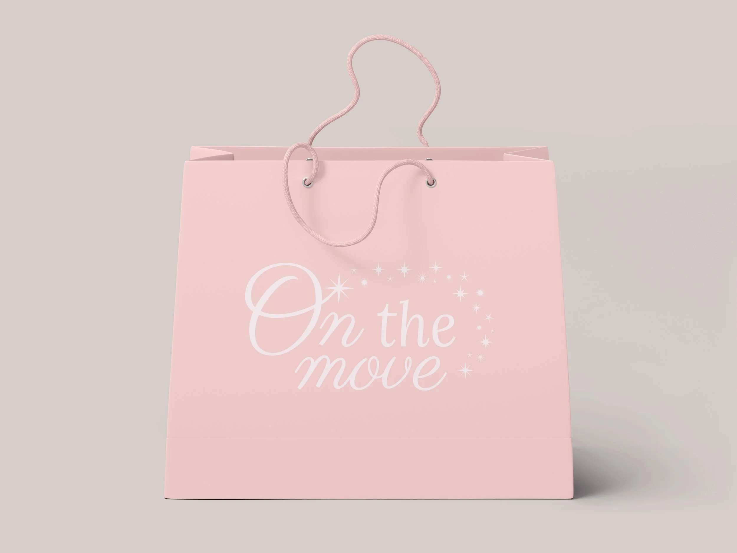
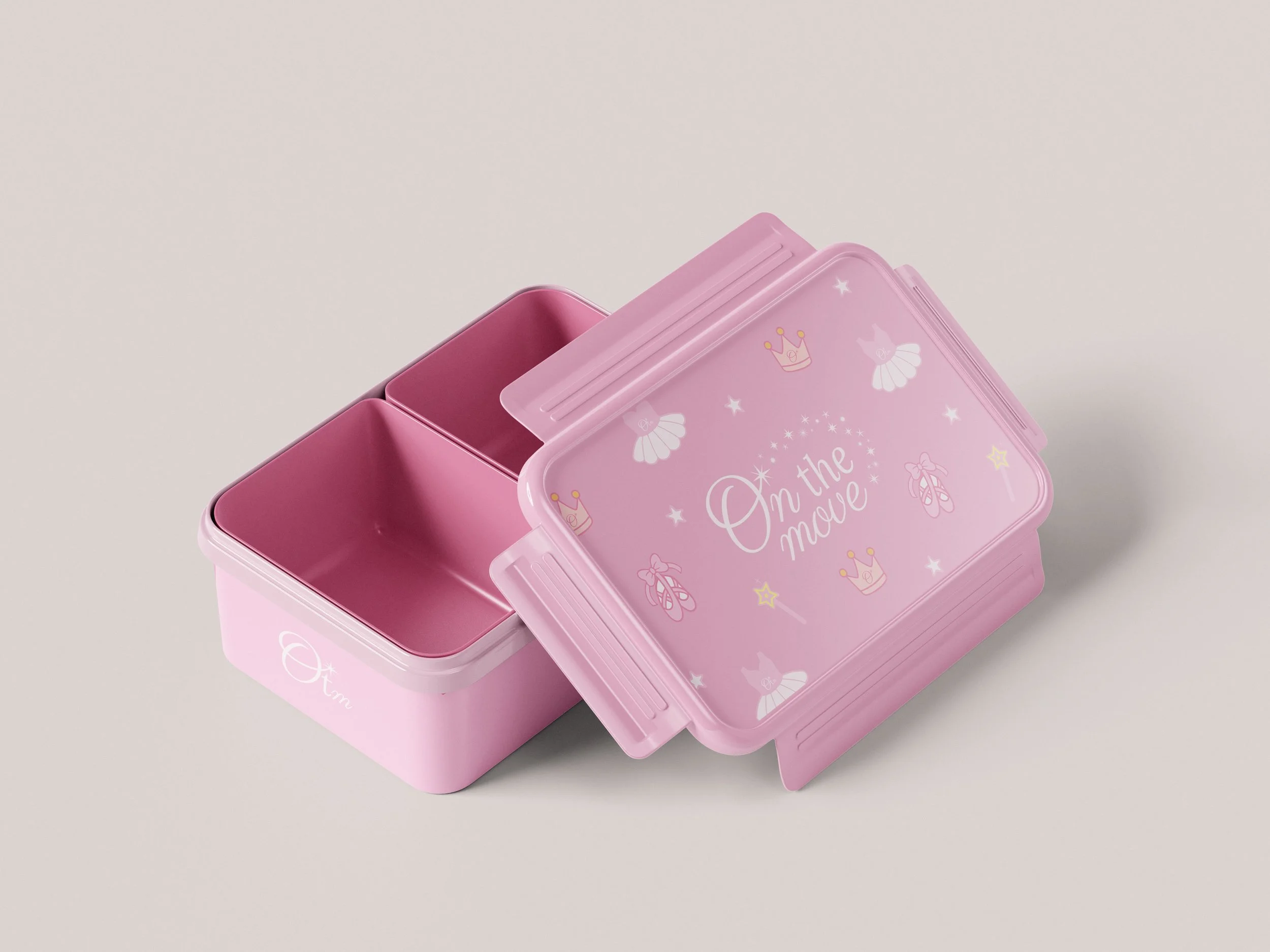
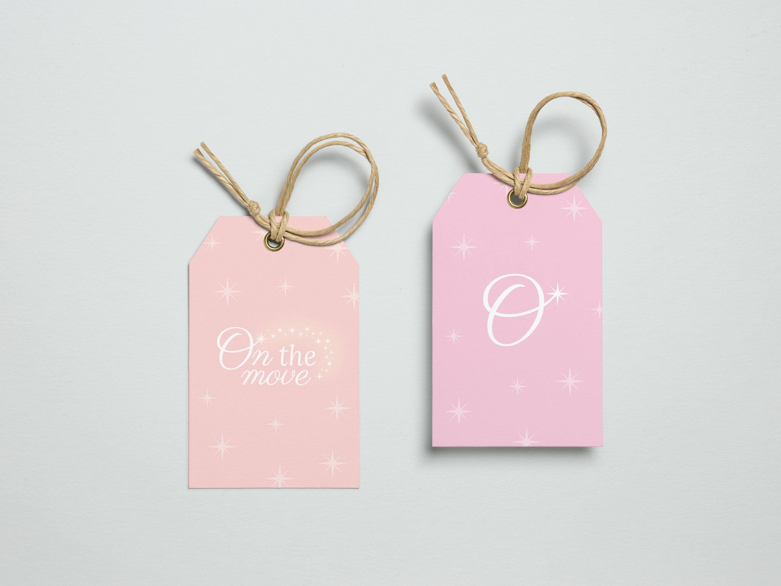
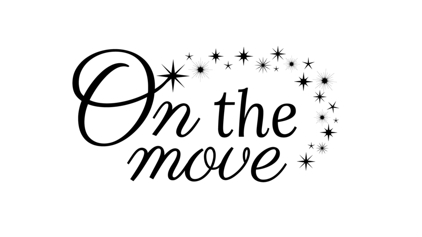
Primary Logo – “On The Move” Wordmark
El logotipo completo representa la esencia de On The Move. La combinación de tipografías transmite sofisticación y calidez, mientras que el arco de estrellas refuerza la idea de movimiento, magia y brillo. Es la versión más representativa y se utiliza en comunicaciones institucionales, branding principal y piezas de alto impacto.
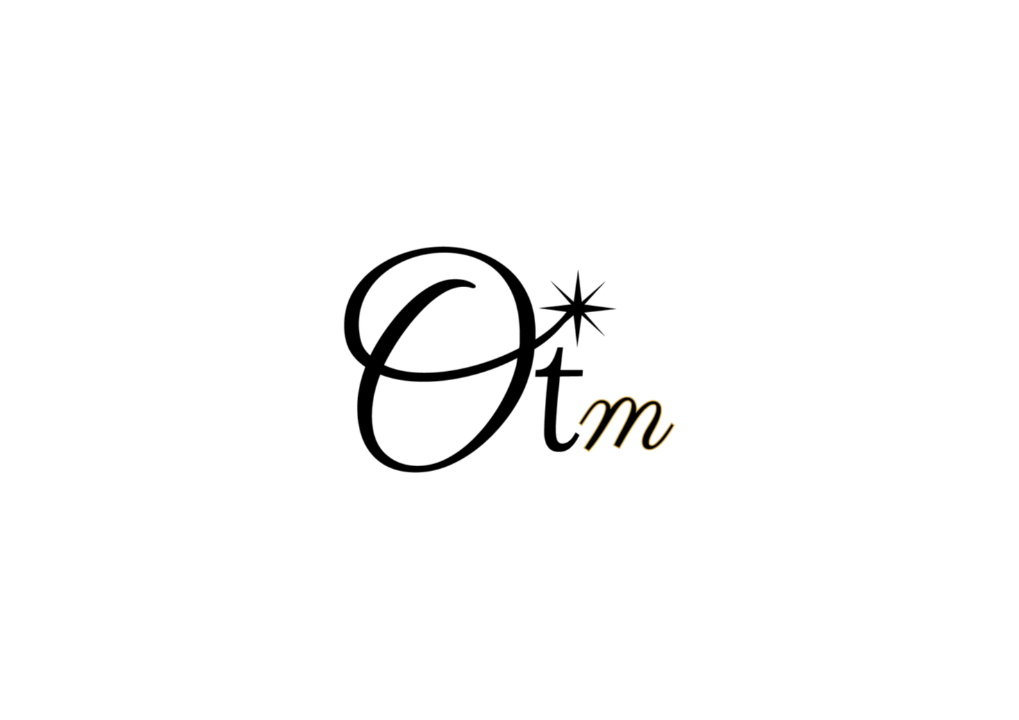
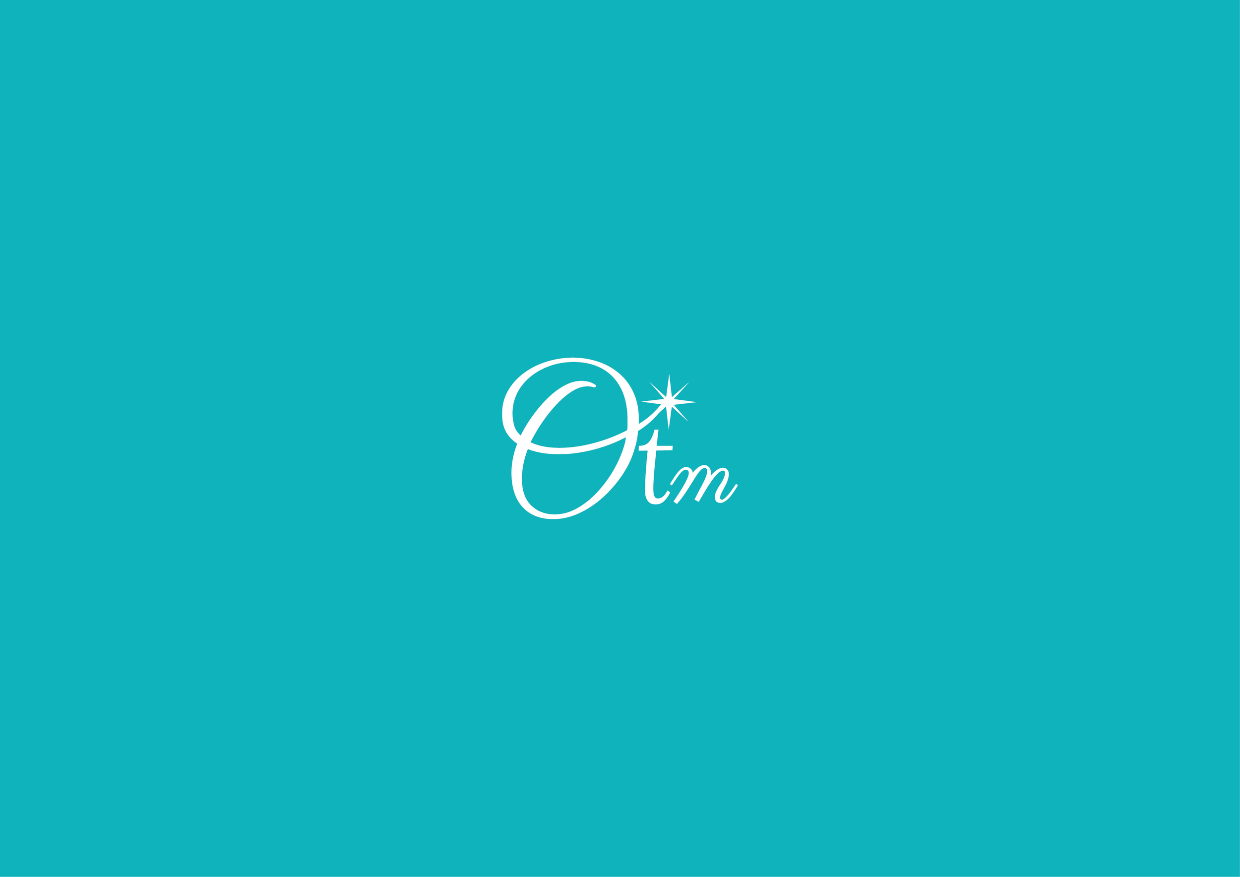
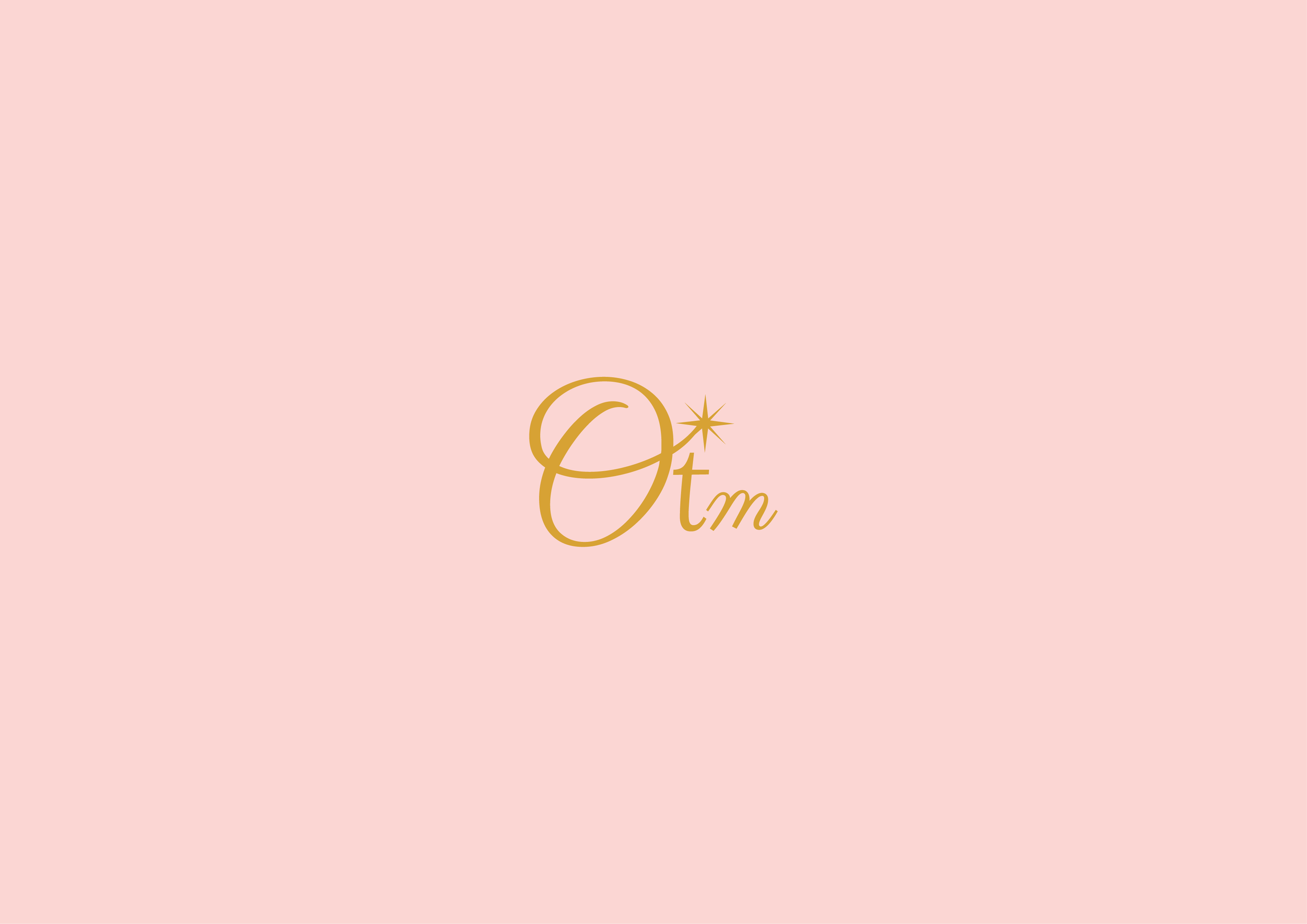
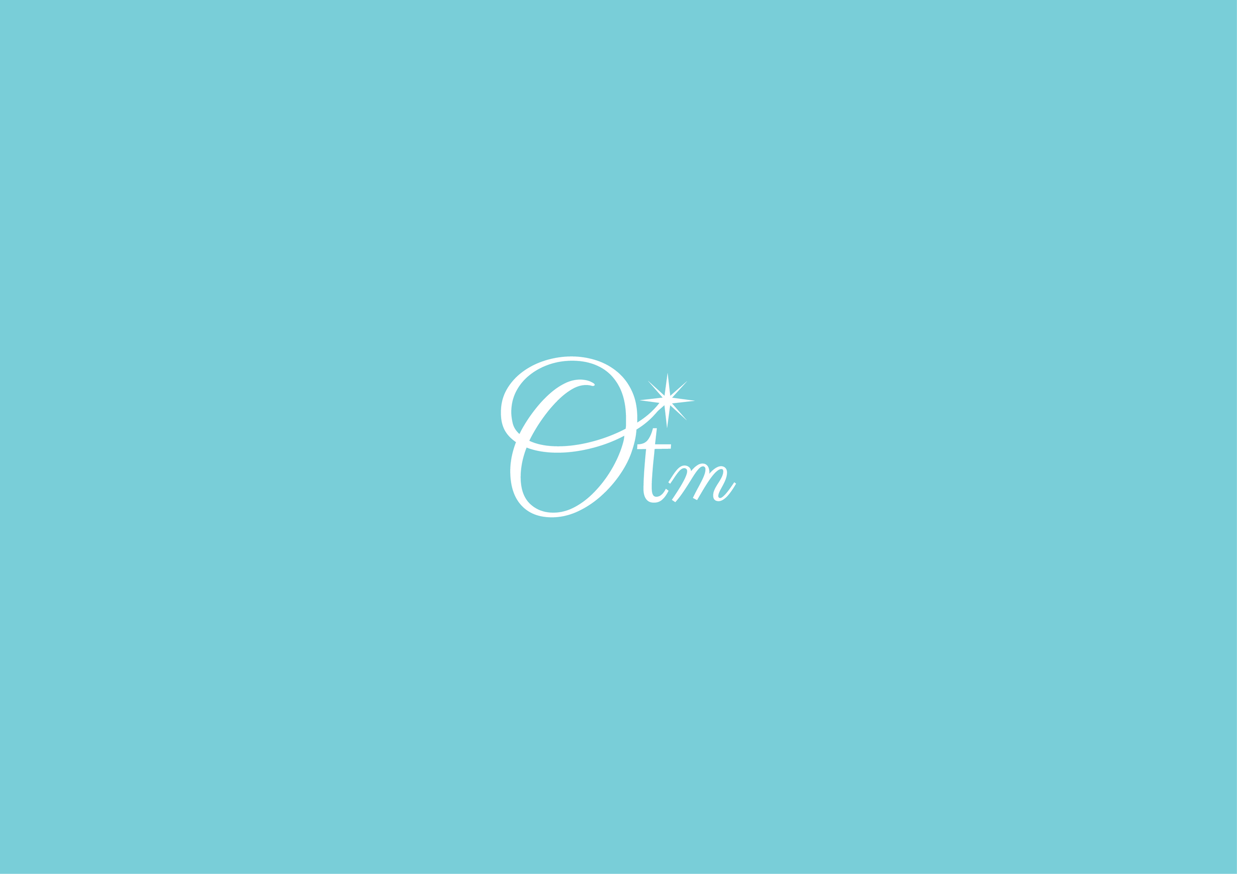
Secondary Mark – “Otm”
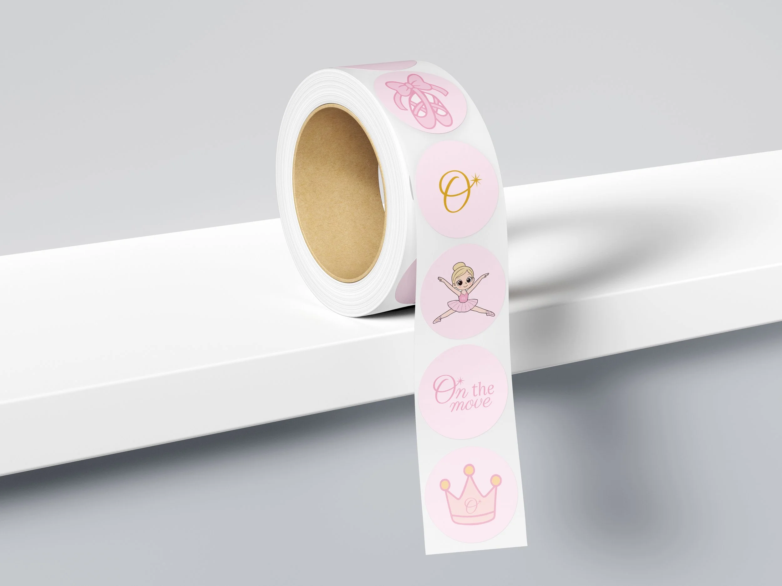
The secondary logo presents a more compact expression of the brand identity. The stylized “O,” combined with the central star, creates an elegant and distinctive seal, while the “tm” lettering completes the reference to the brand name. This variation maintains strong visual recognition and is ideal for labels, packaging, social media, and applications where the primary logo cannot be reproduced clearly.

Secondary Mark – The "O" Icon
The isotipo reduces the logo to its most essential elements: the initial “O” paired with the star. Designed as a versatile and memorable icon, it works seamlessly as a favicon, graphic detail, badge, or small-scale application where simplicity is key—while still preserving the brand’s visual identity.


Color Palette
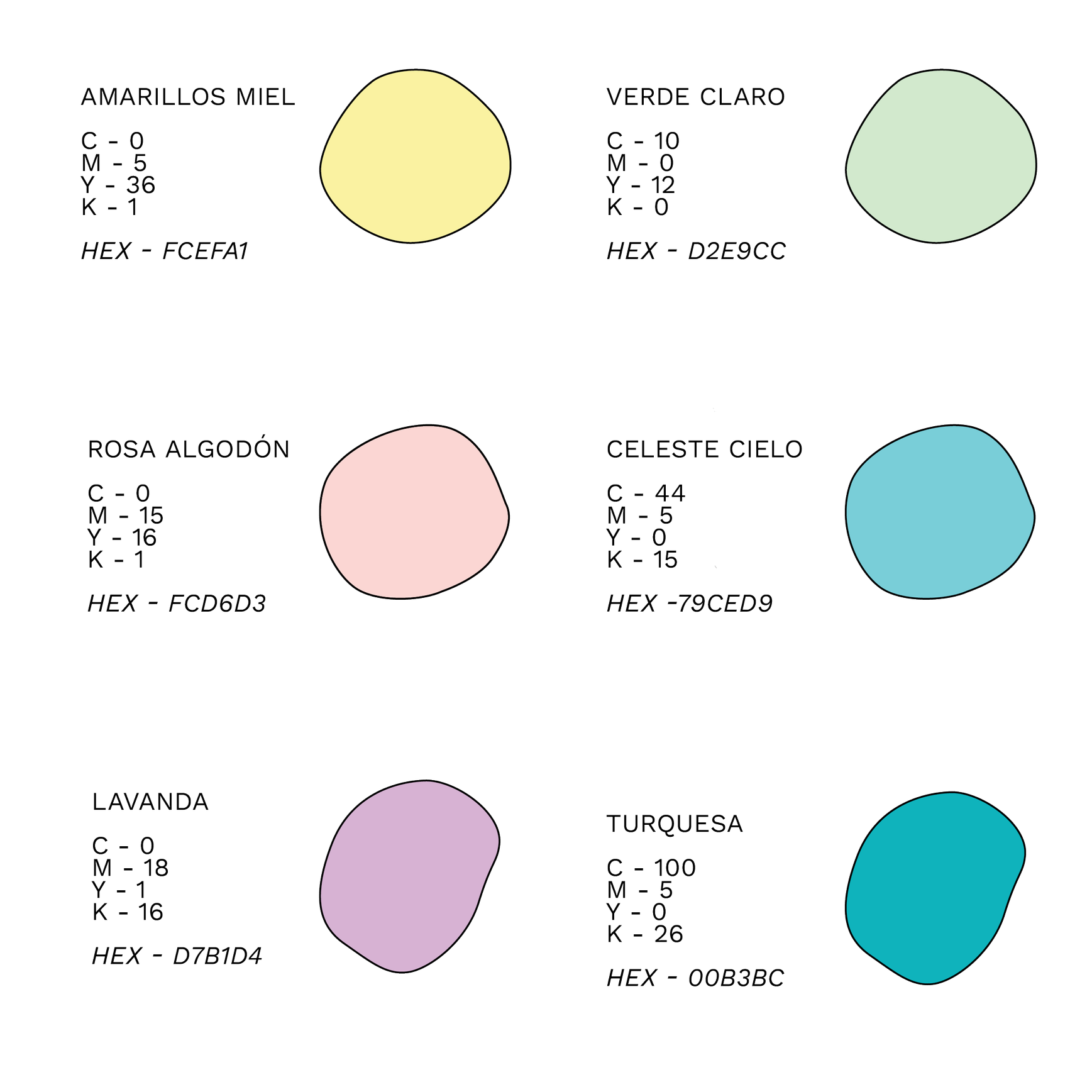
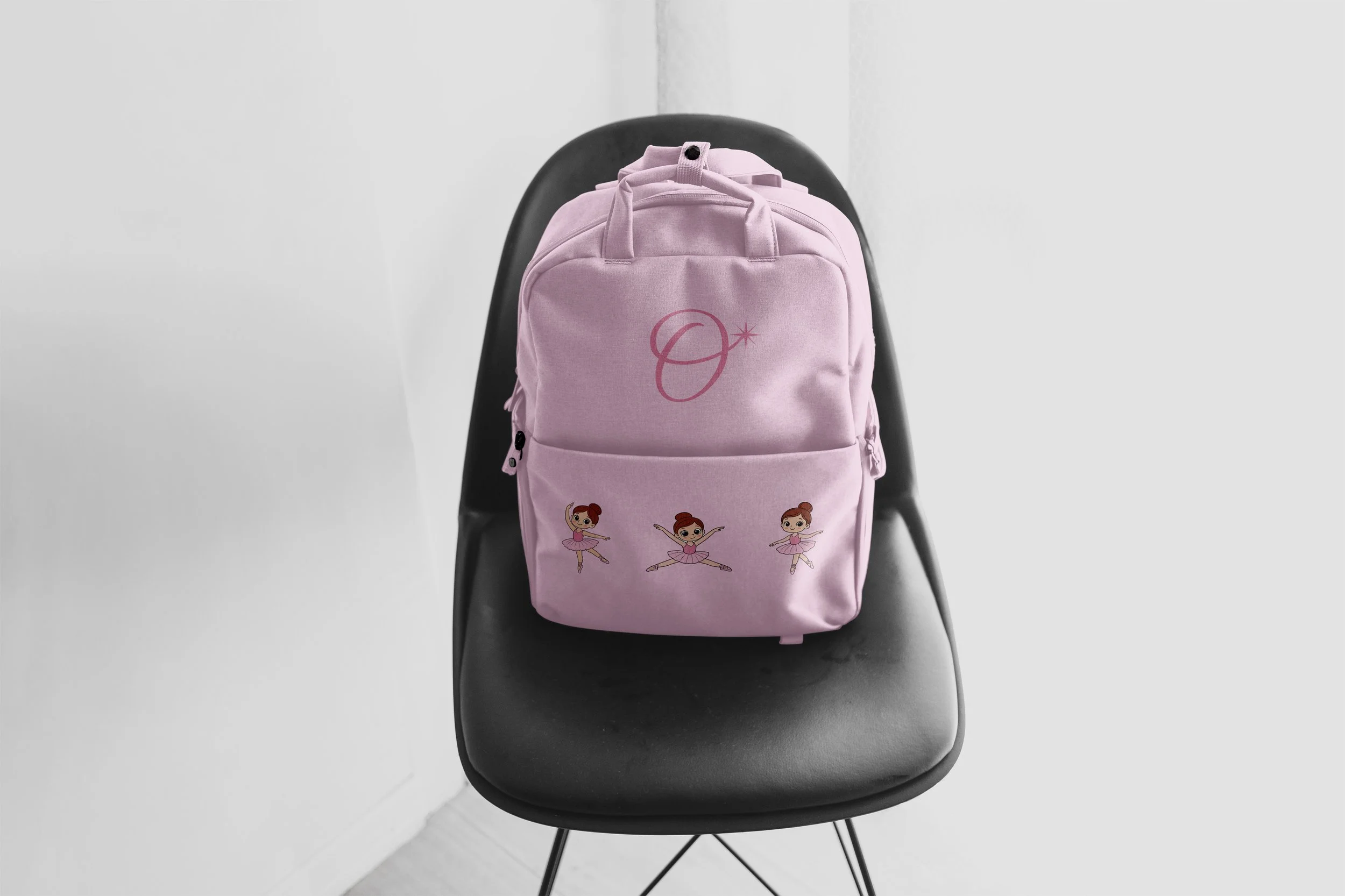
On The Move’s color palette reflects the essence of the brand: warmth, joy, and creativity. The selected soft pastel tones evoke a sense of lightness, tenderness, and playfulness, capturing the magic of the childhood universe. Each color has been carefully chosen to reinforce the brand’s values, inspiring happy moments, imagination, and artistic expression for girls and families.
Iconography
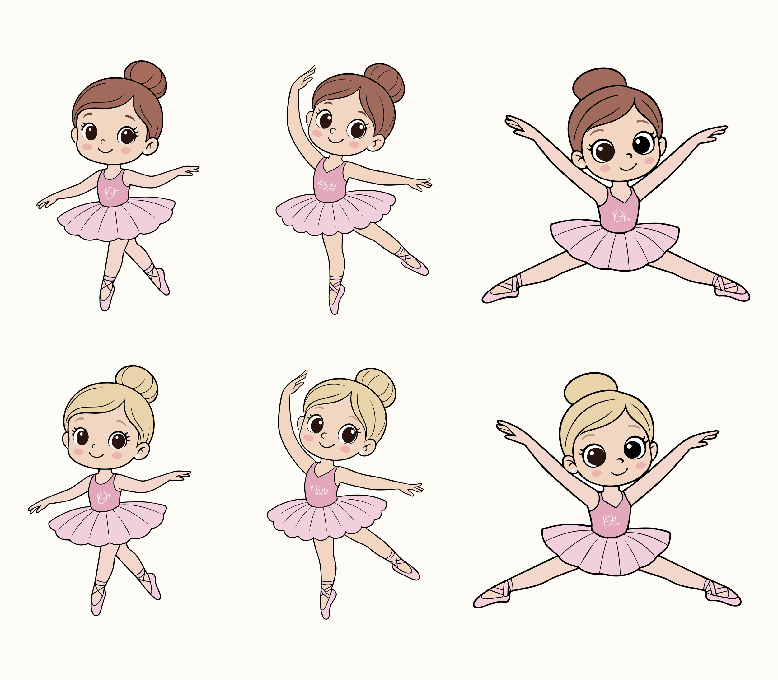
On The Move’s iconography is custom and hand-illustrated, reinforcing the brand’s warm, playful, and approachable character. Organic shapes and fluid strokes convey the essence of the brand, inspired by creativity, play, and the magic of childhood. Through expressive graphic elements, the icon system evokes fun, movement, and joyful moments, connecting naturally with the world of girls and their artistic expression.