BRANDING
Concept & Strategy
Carte Diem was born from the desire to create something personal, meaningful, and close. Conceived between friends, the brand finds beauty in everyday gestures and simple moments. Its visual universe is inspired by real urban scenes, shared experiences, and familiar objects that resonate with a contemporary feminine sensibility.
The aesthetic balances function and emotion: bags designed to accompany daily life, tell stories, and become part of each woman’s rhythm. Carte Diem conveys an effortless elegance, genuine warmth, and a relaxed spirit that invites living with style, authenticity, and freedom.
VISUAL IDENTITY
Logo Design
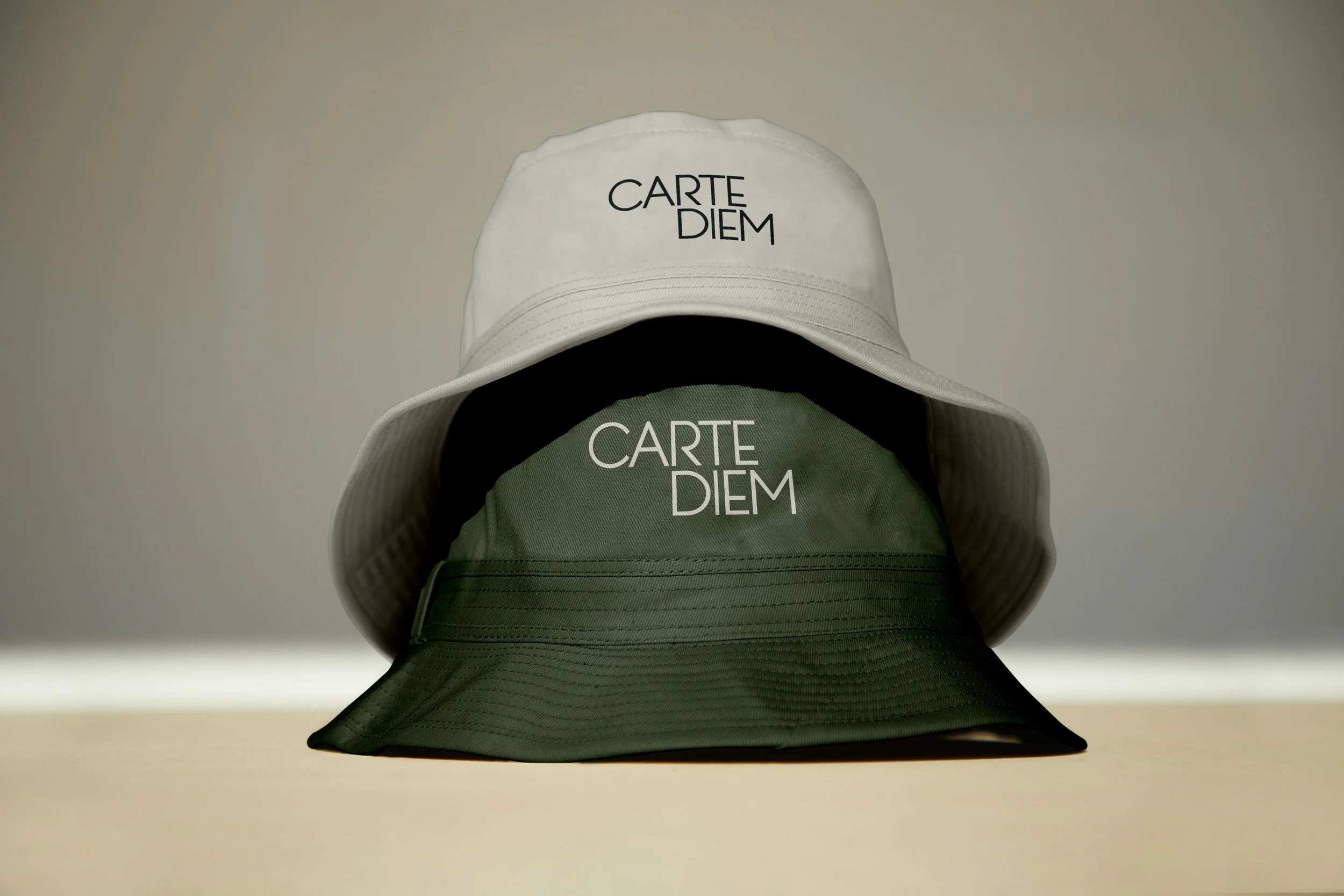
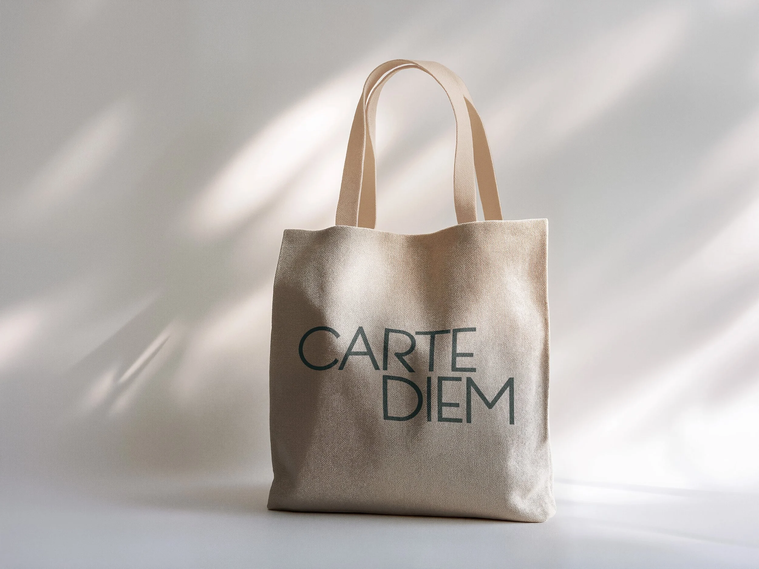
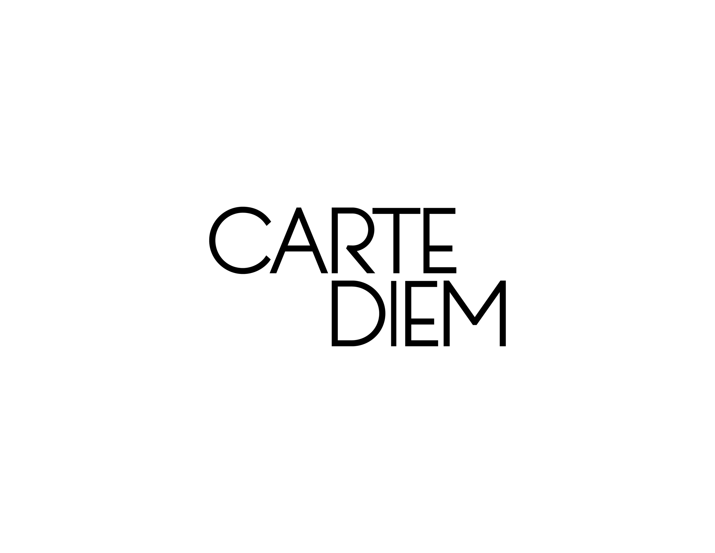
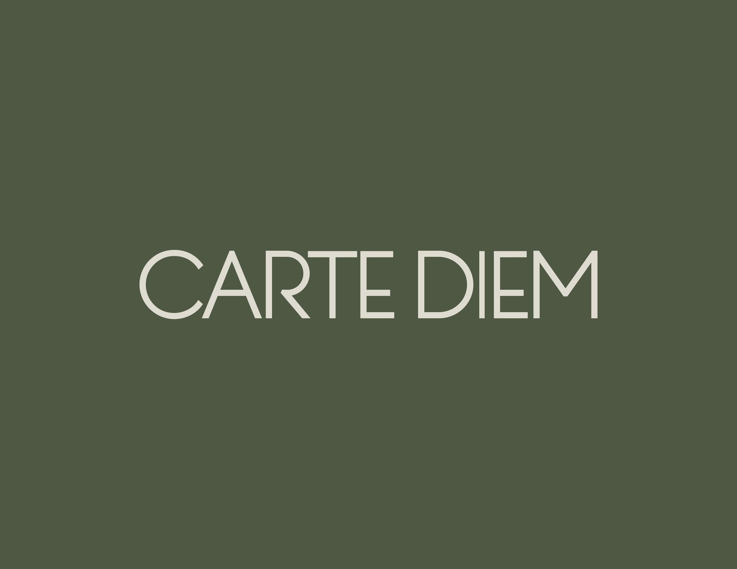
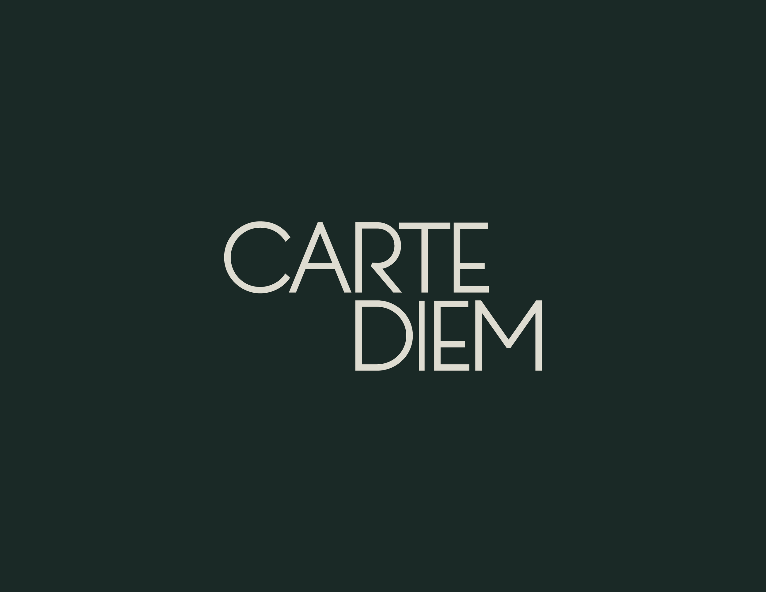
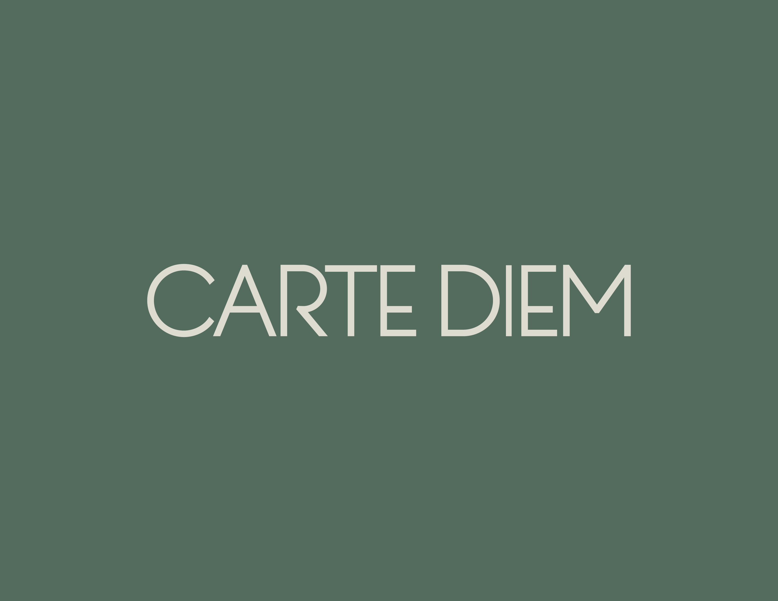
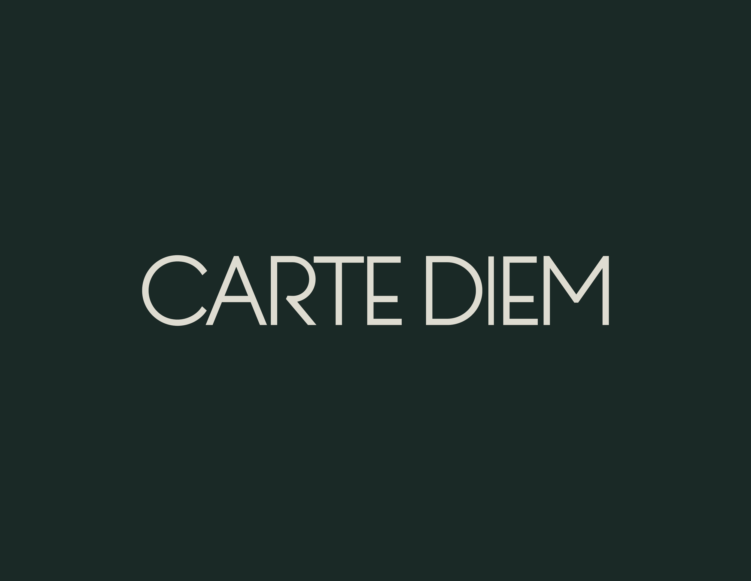
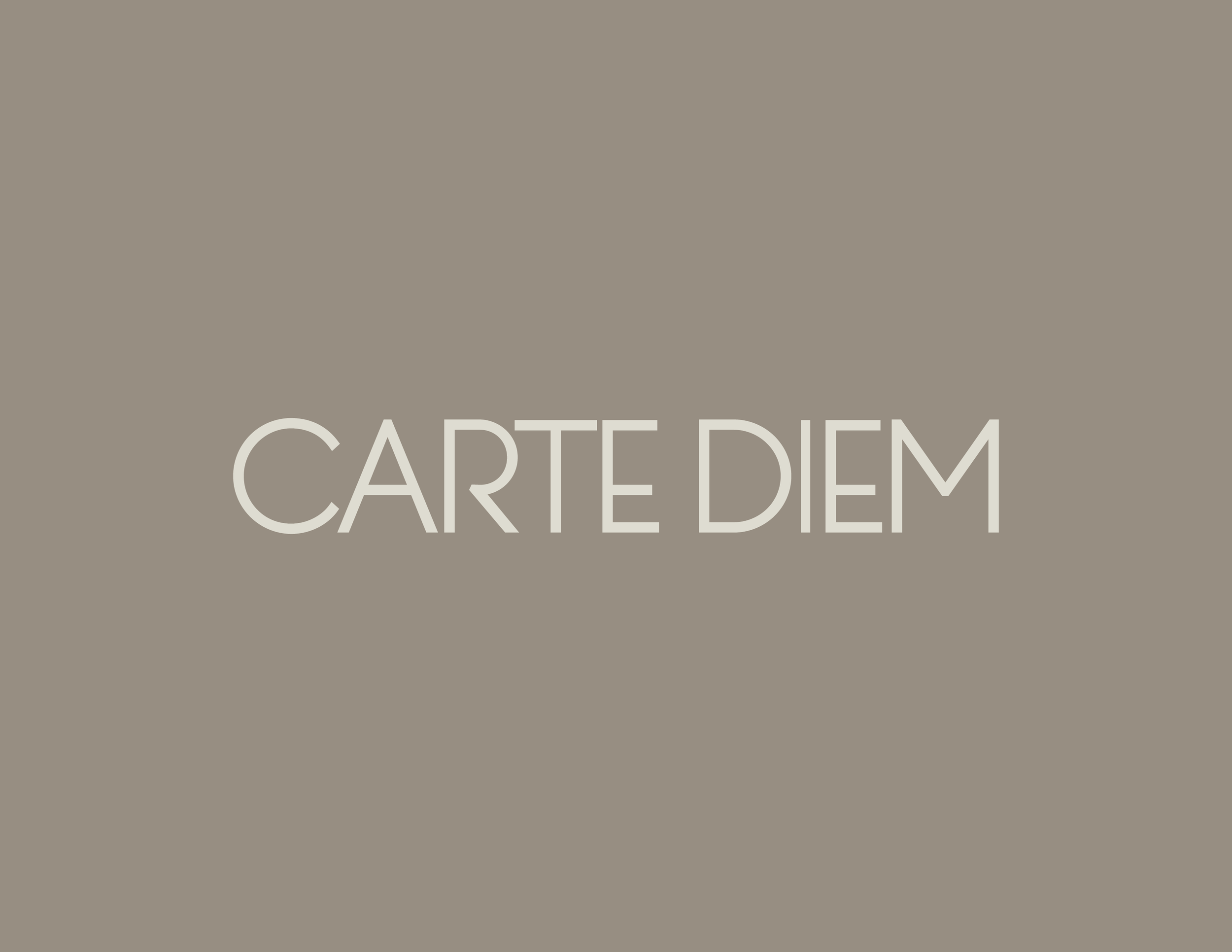
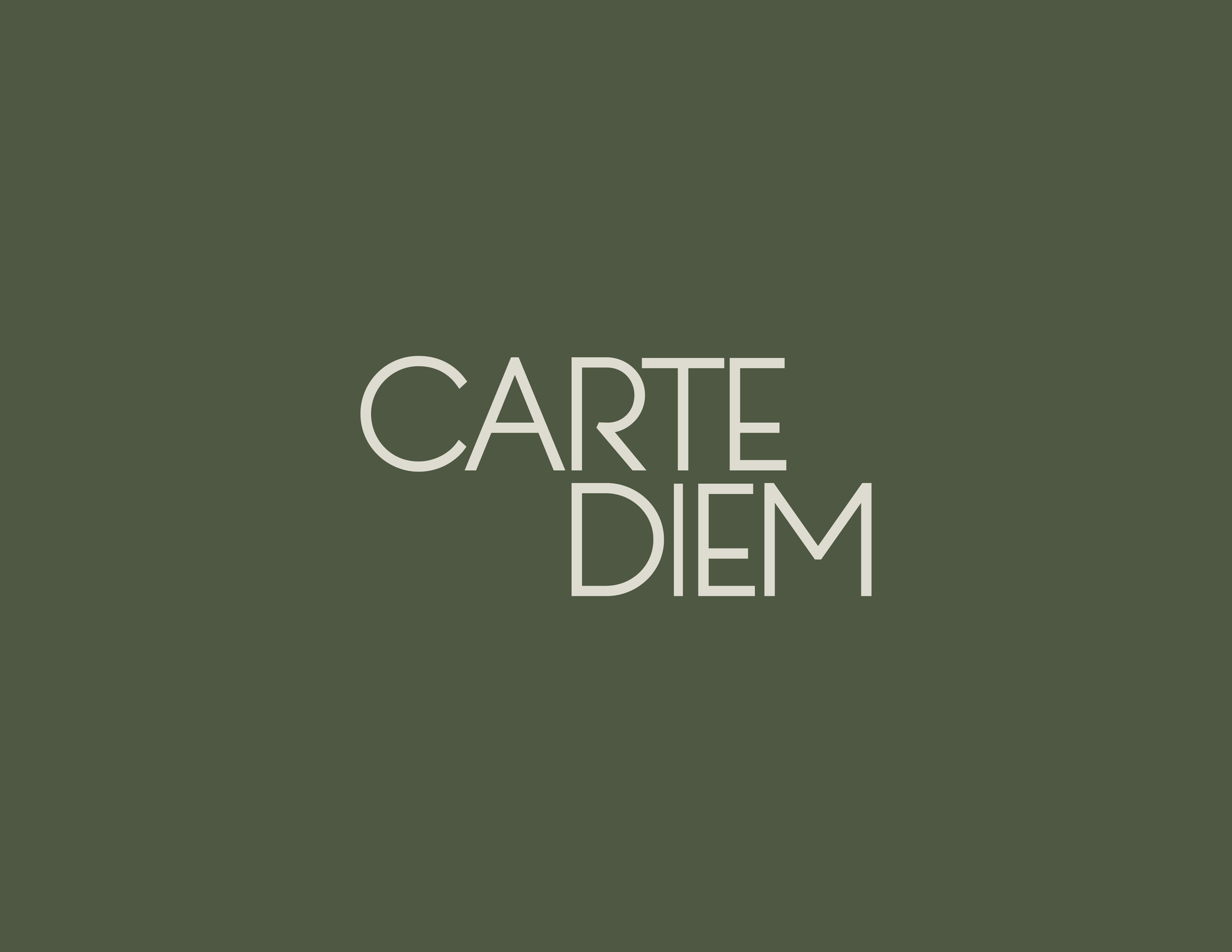
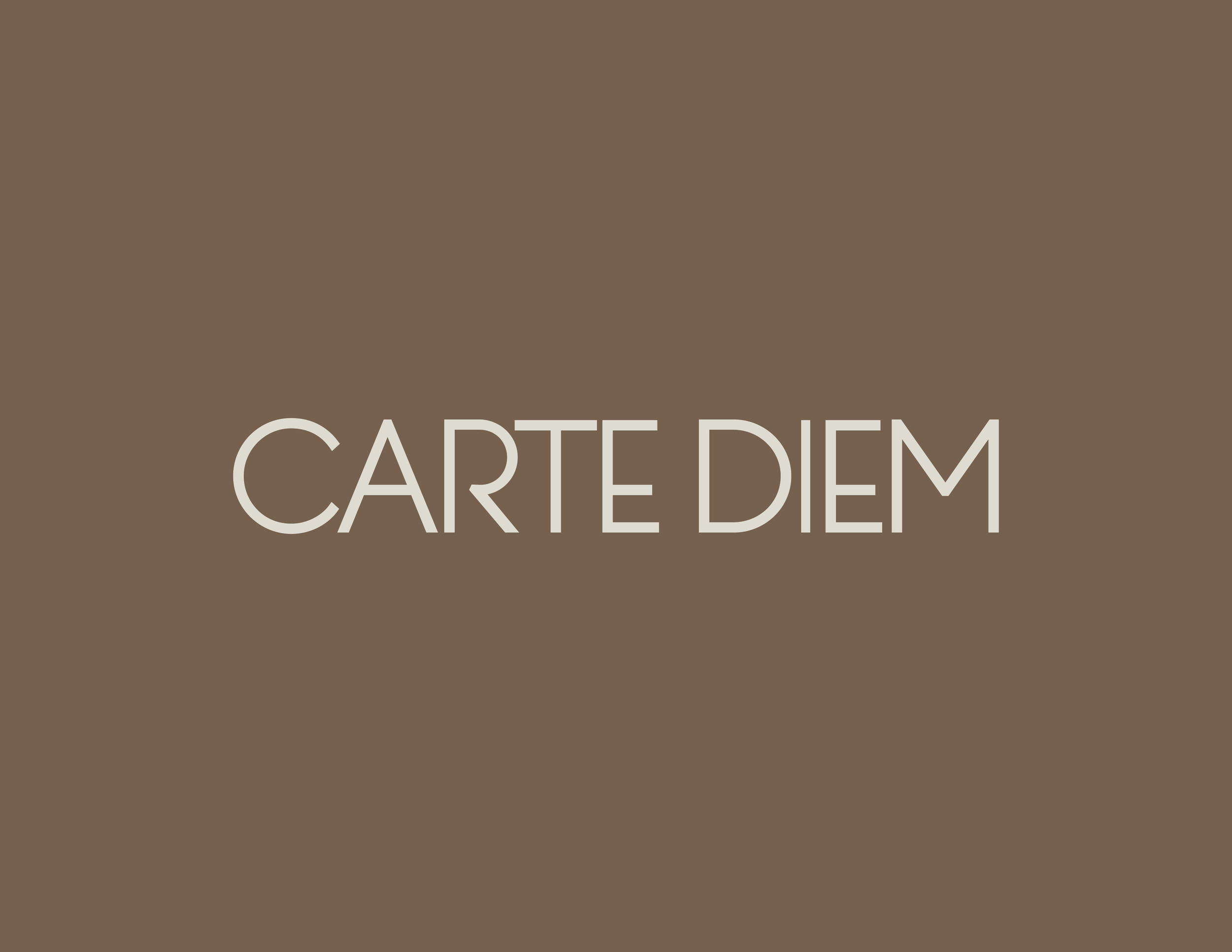
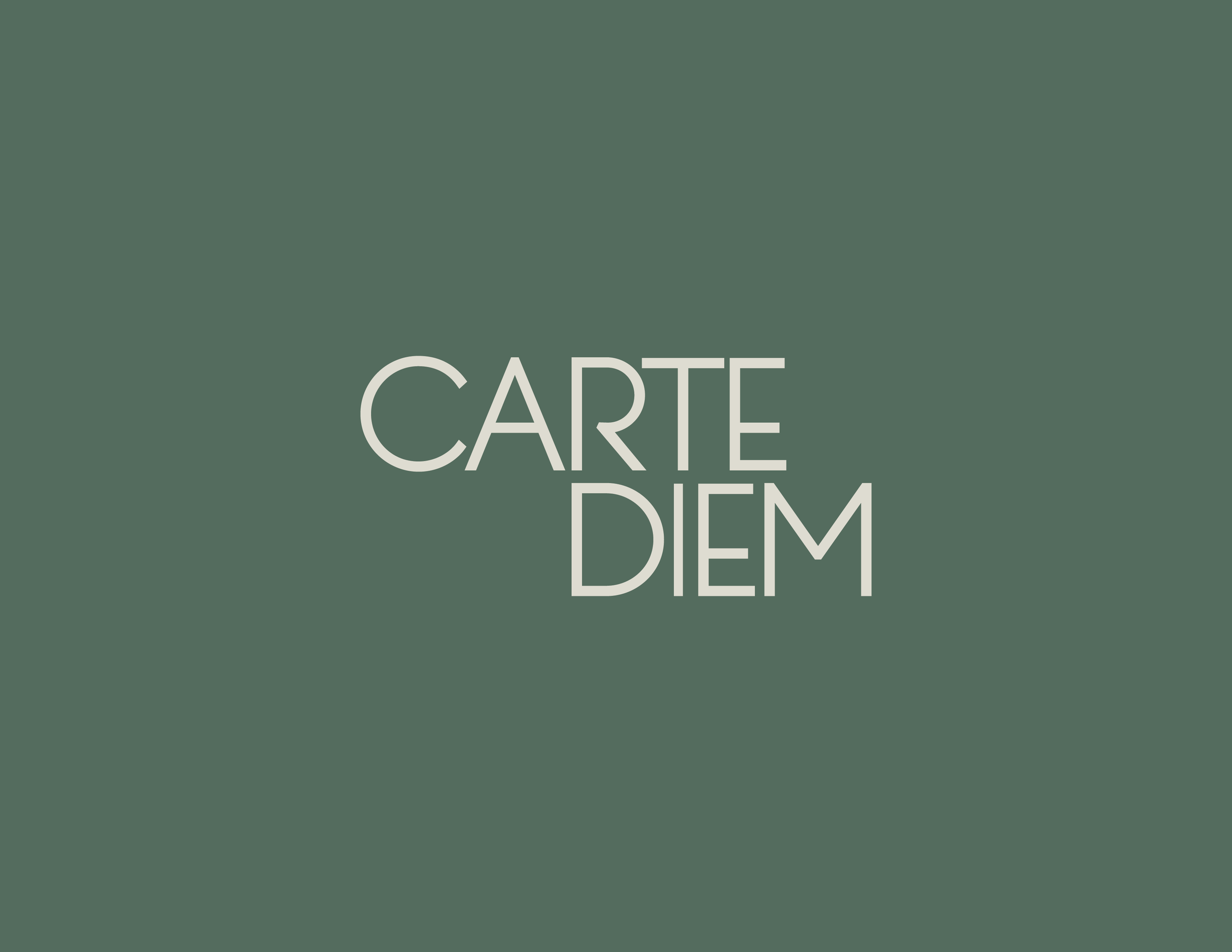
Primary Logo – Carte Diem Wordmark
The Carte Diem logo uses the Penna typeface, chosen for its balance between elegance and structure. Subtle refinements were made to the letterforms, replacing pointed terminals with clean, straight cuts to create a more solid, modern, and confident appearance. The horizontal layout improves readability and allows for flexible use across different applications.
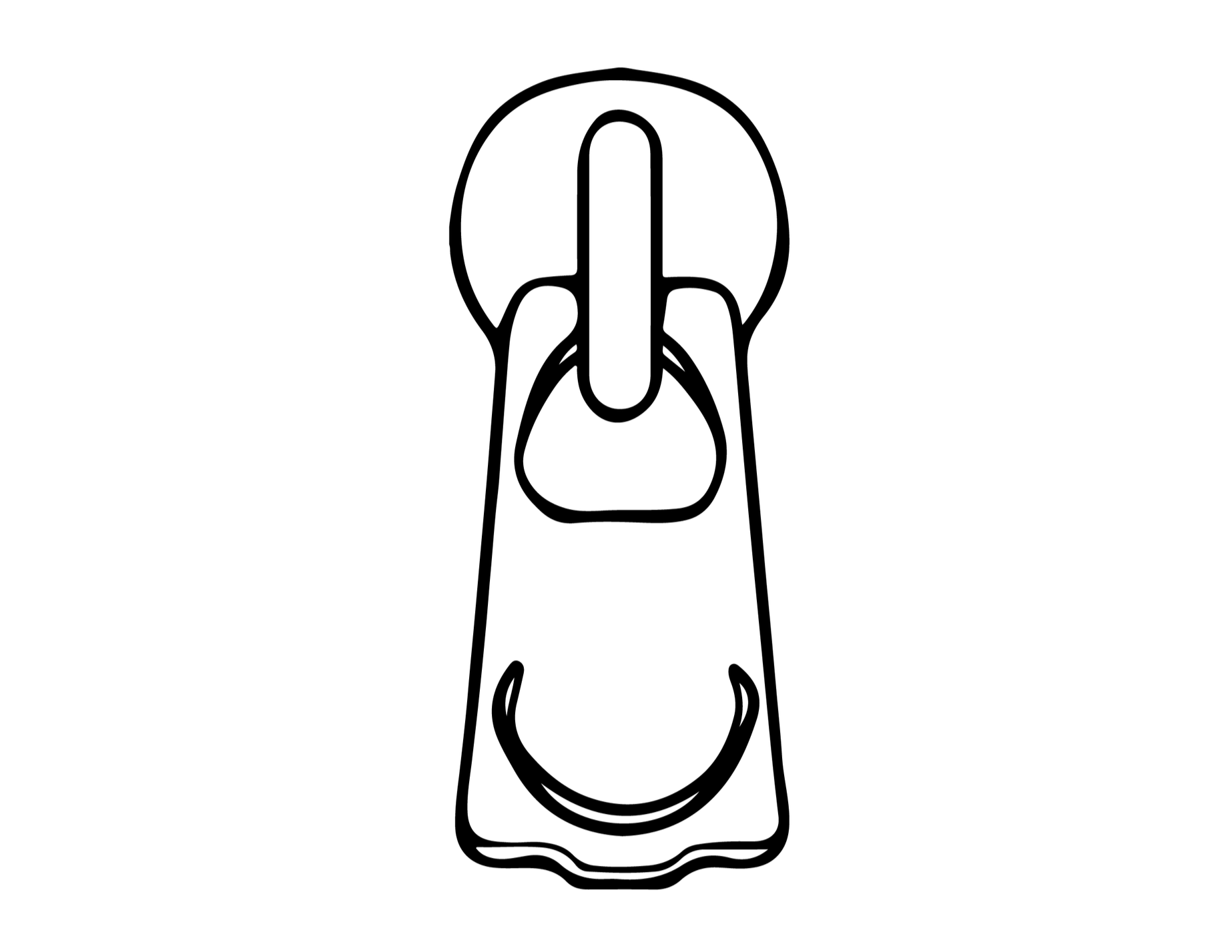
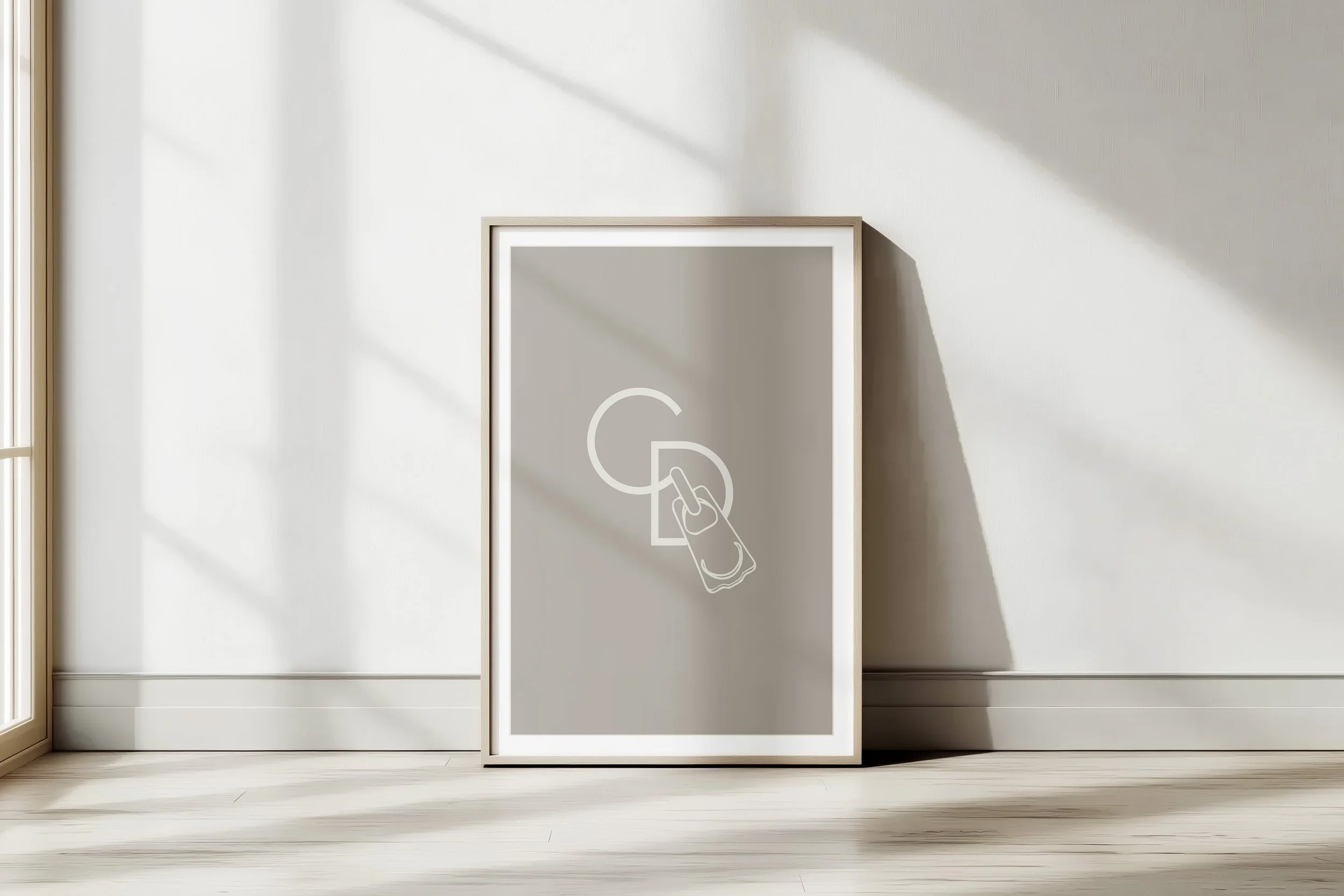
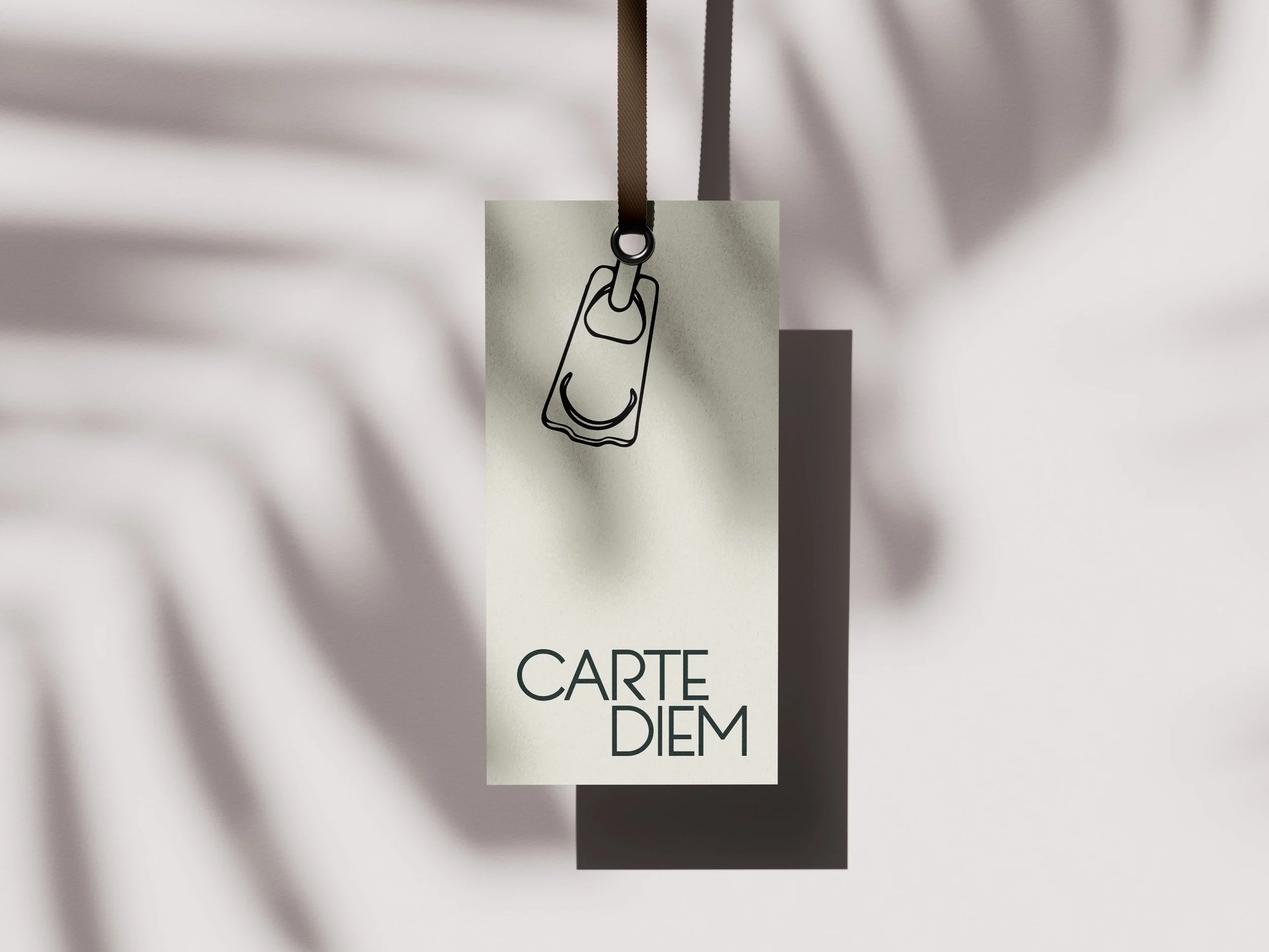
Secondary Mark – Isologo
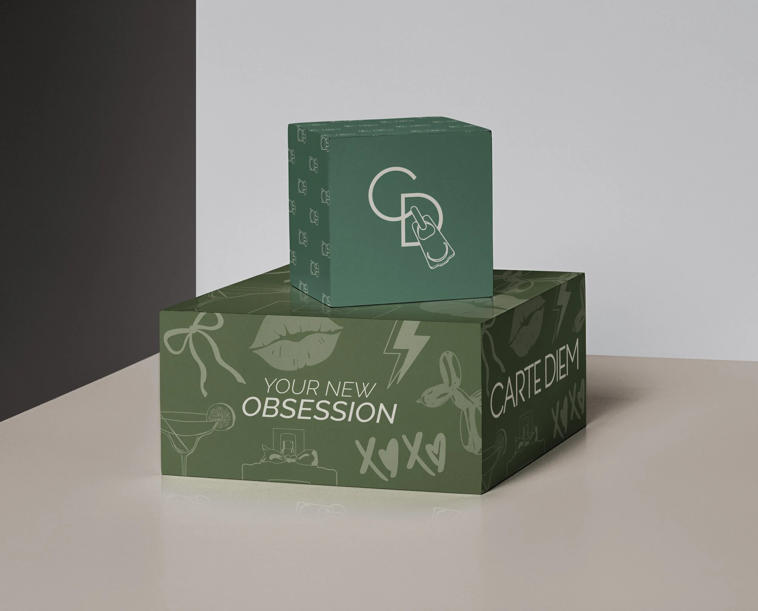
The isologo is hand-drawn and can be applied in different orientations depending on the medium or communicational intent. Whether used vertically, horizontally, or inverted, it maintains strong legibility and a distinctive character. Subtly embedded within the symbol are the letters “C” and “D,” the initials of the brand, adding a conceptual layer to the design. This versatility enhances the dynamism of the visual identity and allows for use in high-impact or decorative applications without compromising overall coherence.


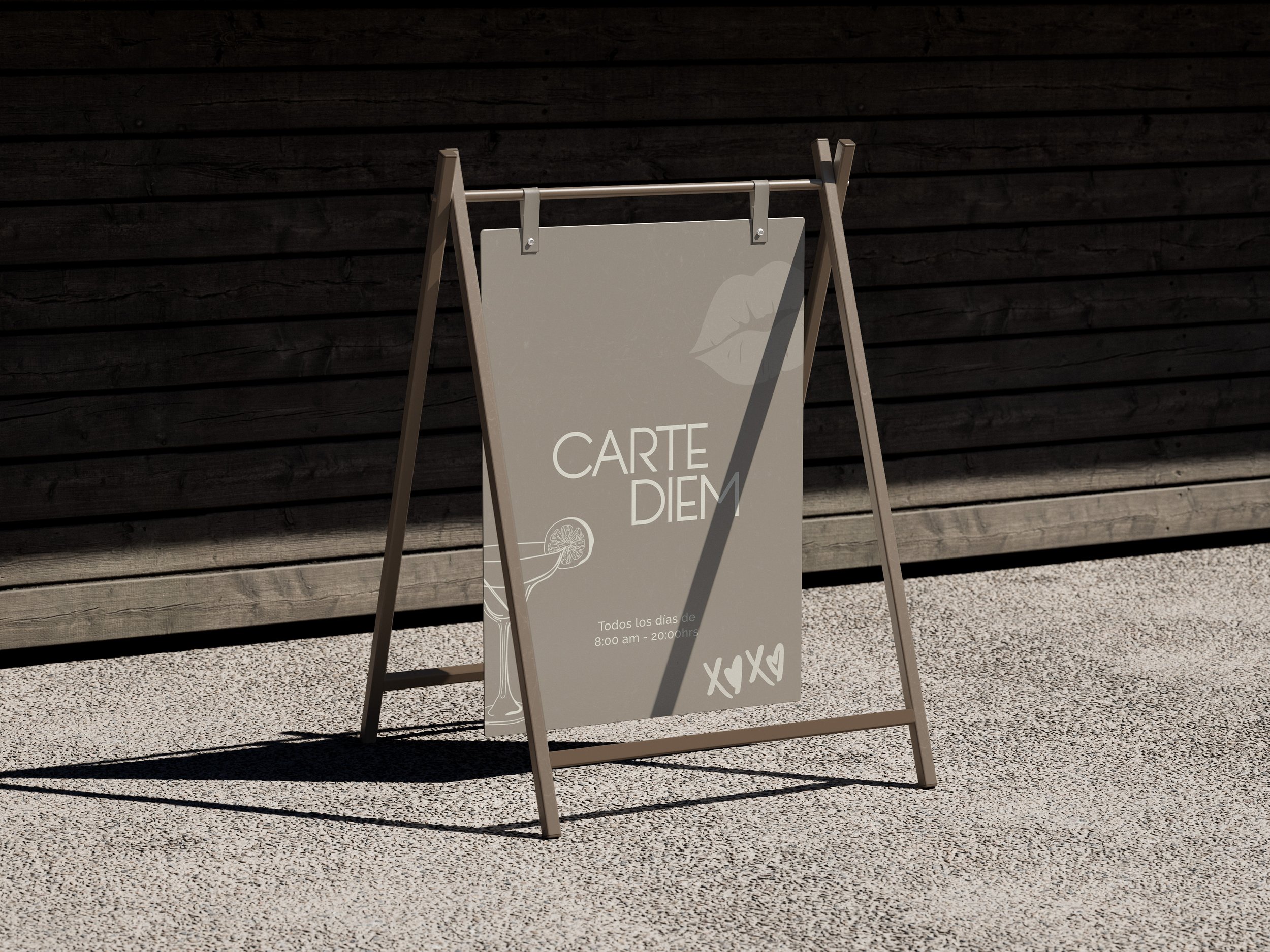
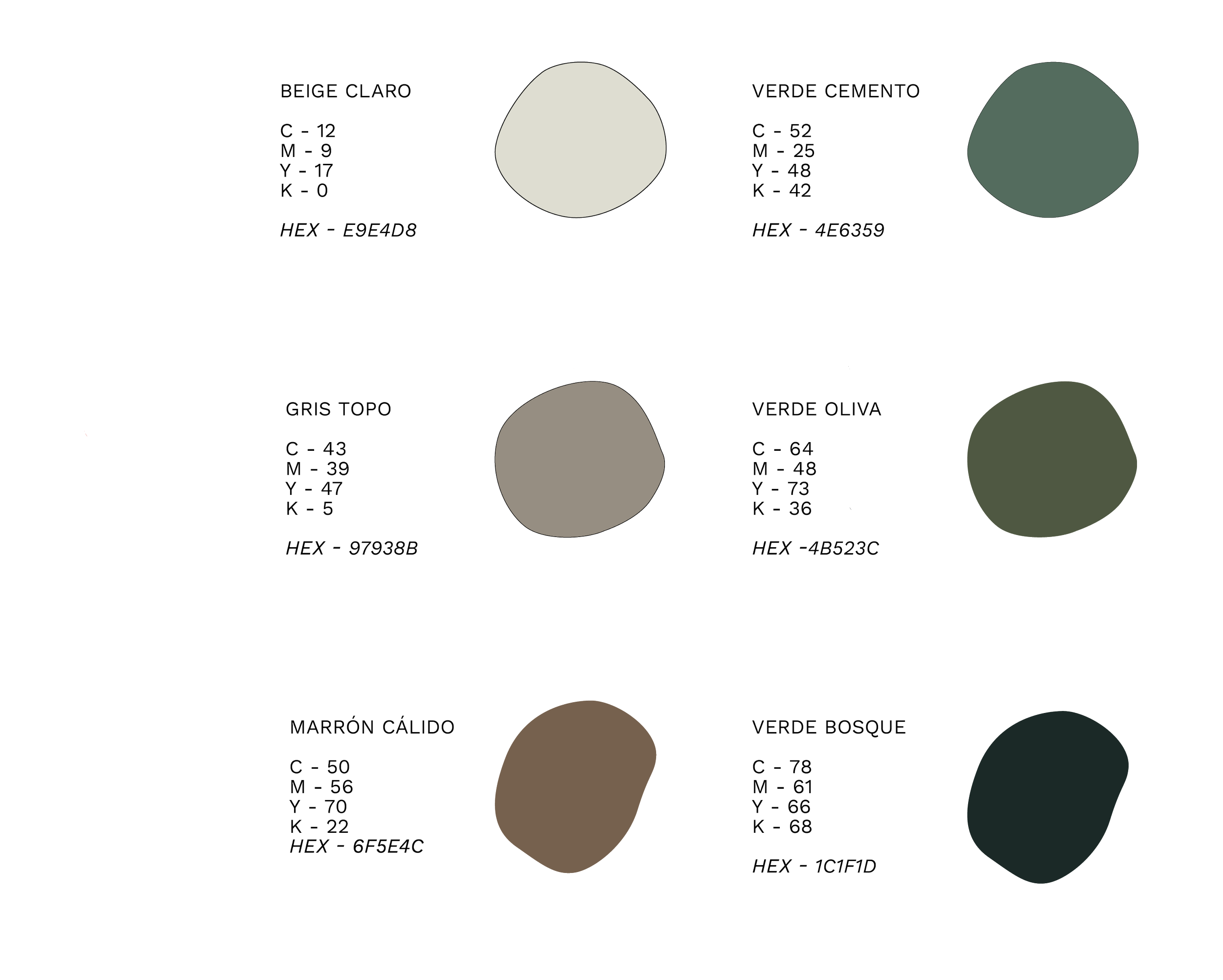
Color Palette
Carte Diem’s color palette was designed to convey warmth, restraint, and a timeless aesthetic. Earthy tones and natural greens evoke a connection to everyday life, organic materials, and craftsmanship. Each color was carefully selected to support the brand’s visual universe with balance and harmony. This chromatic range adapts seamlessly across different formats while maintaining strong visual coherence.
Iconography
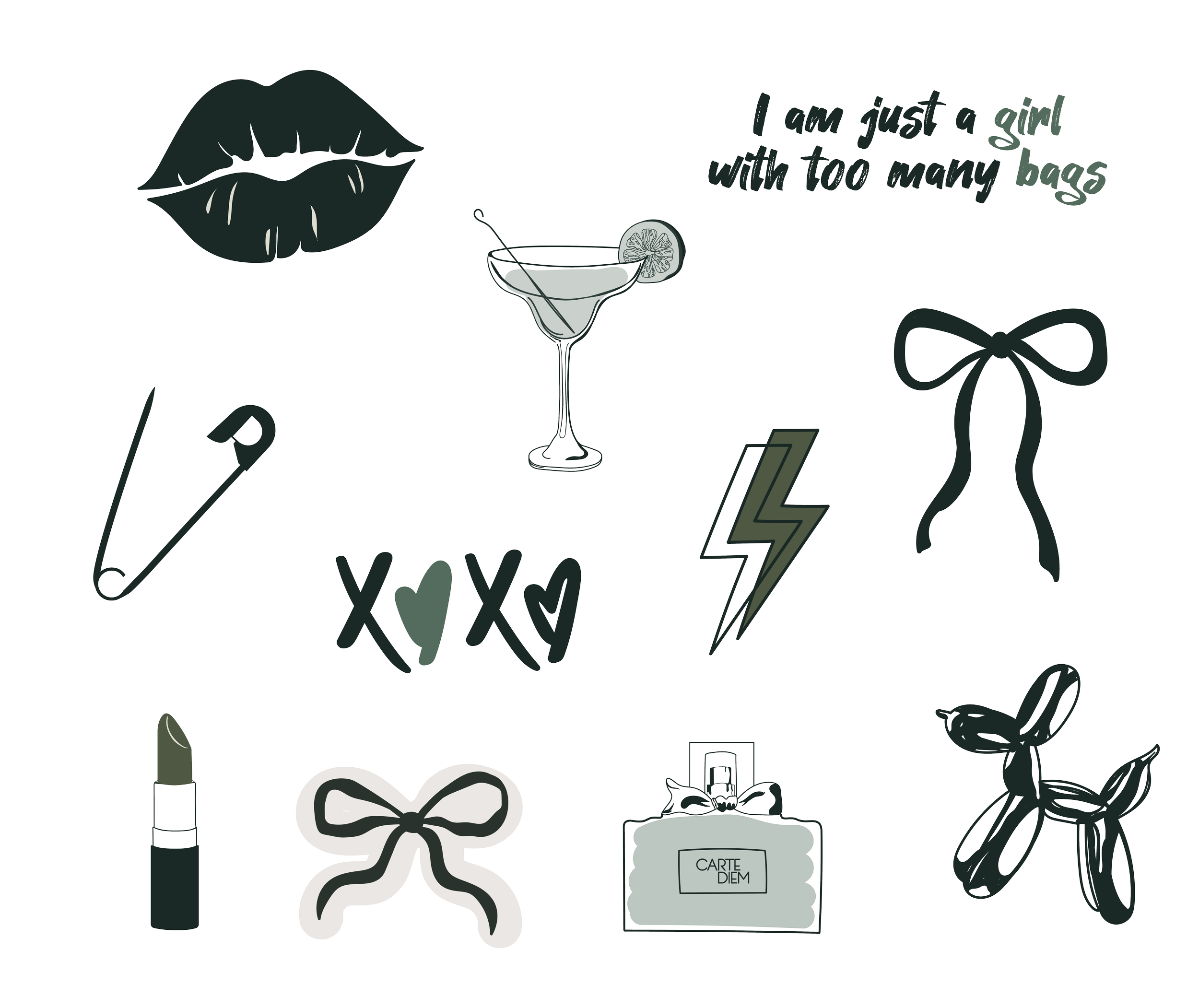
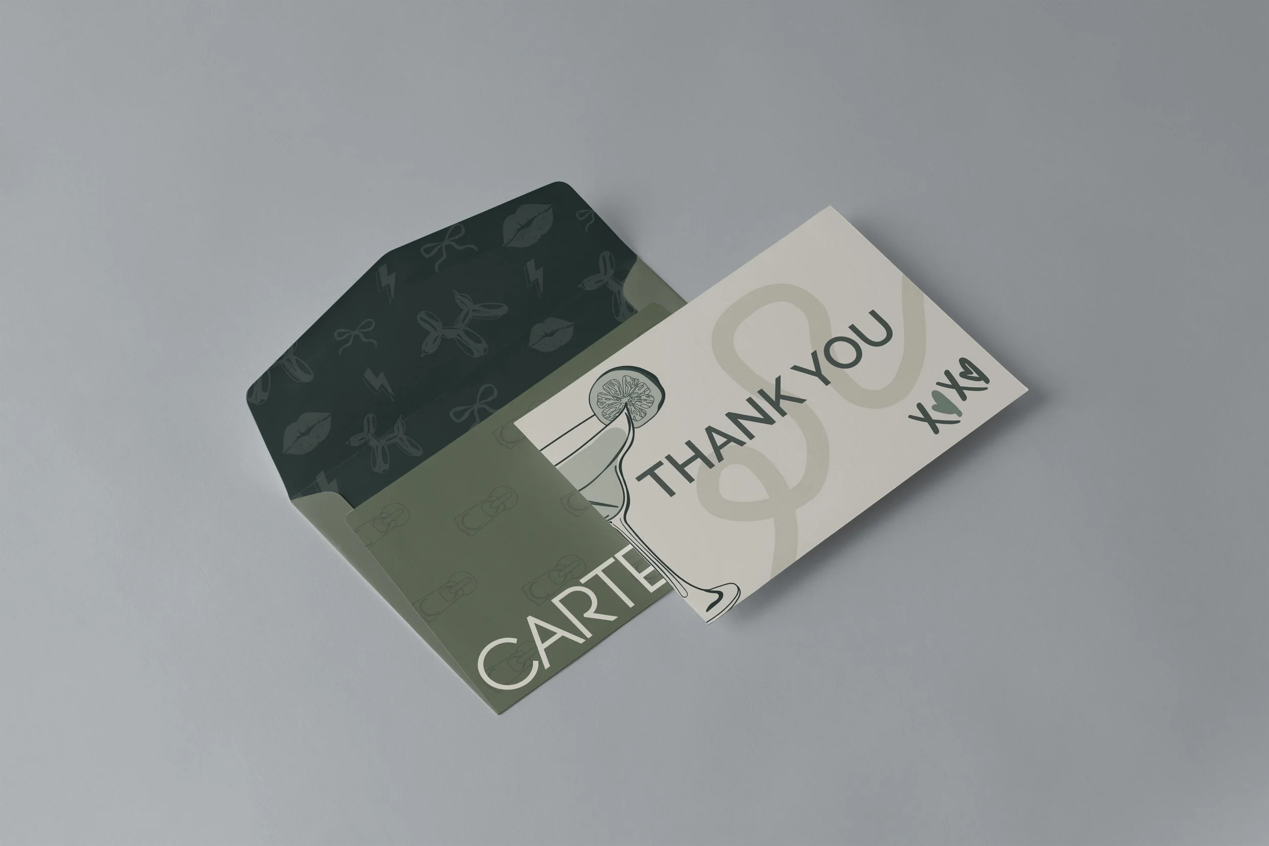
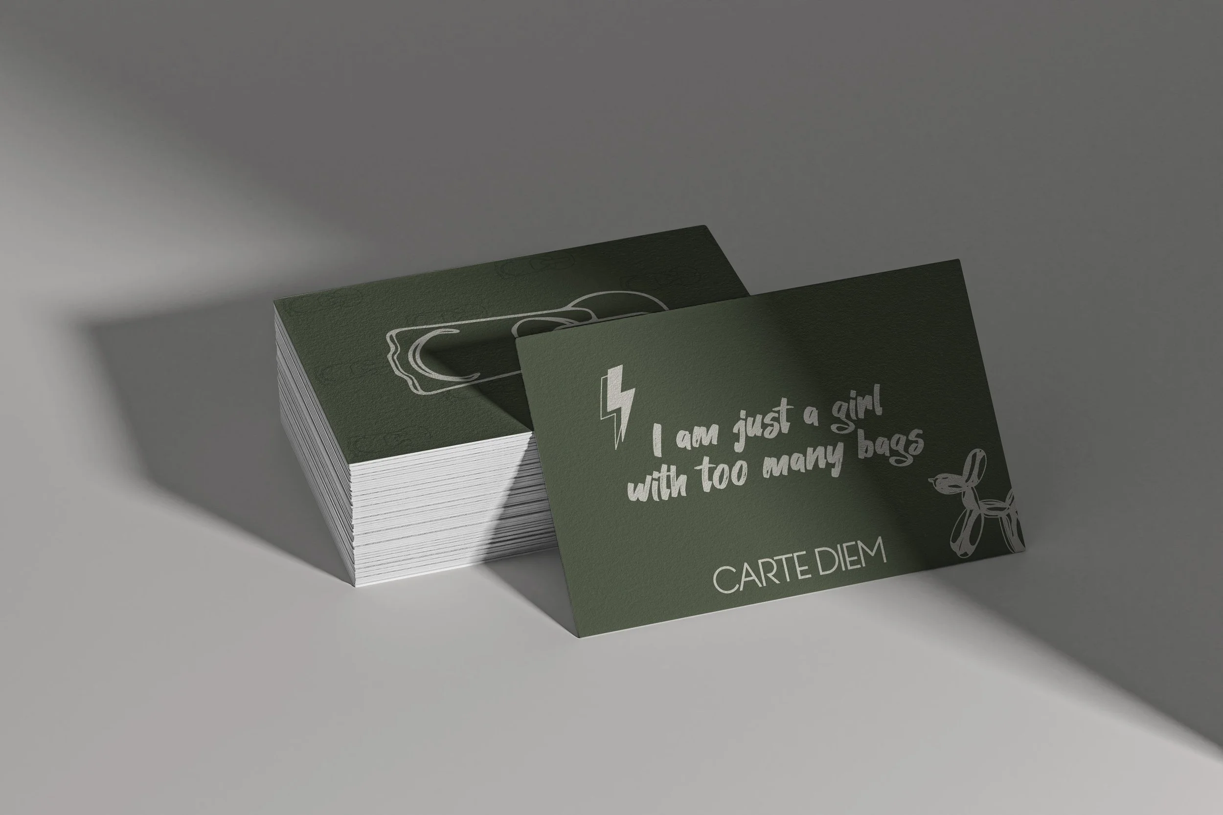
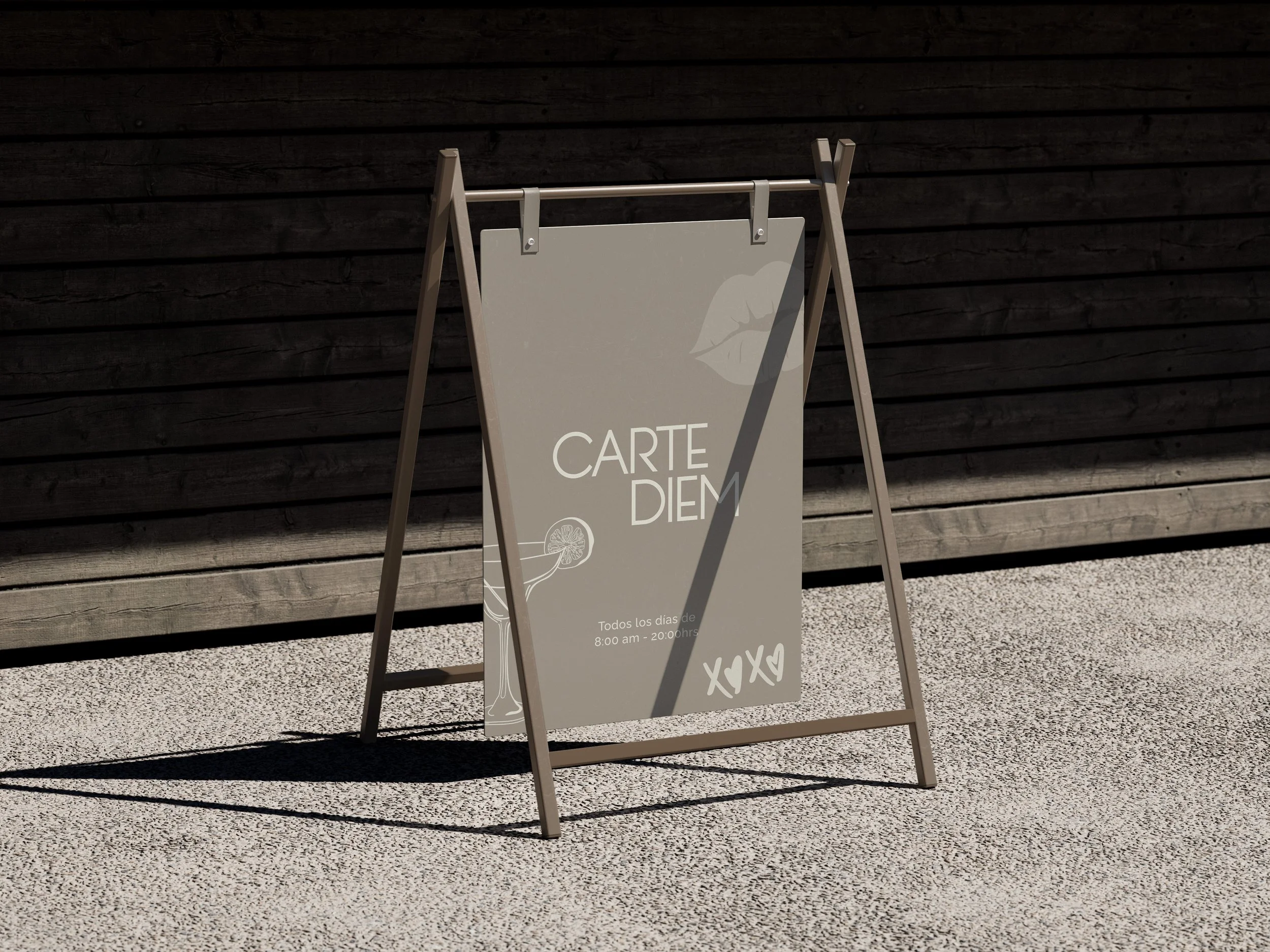
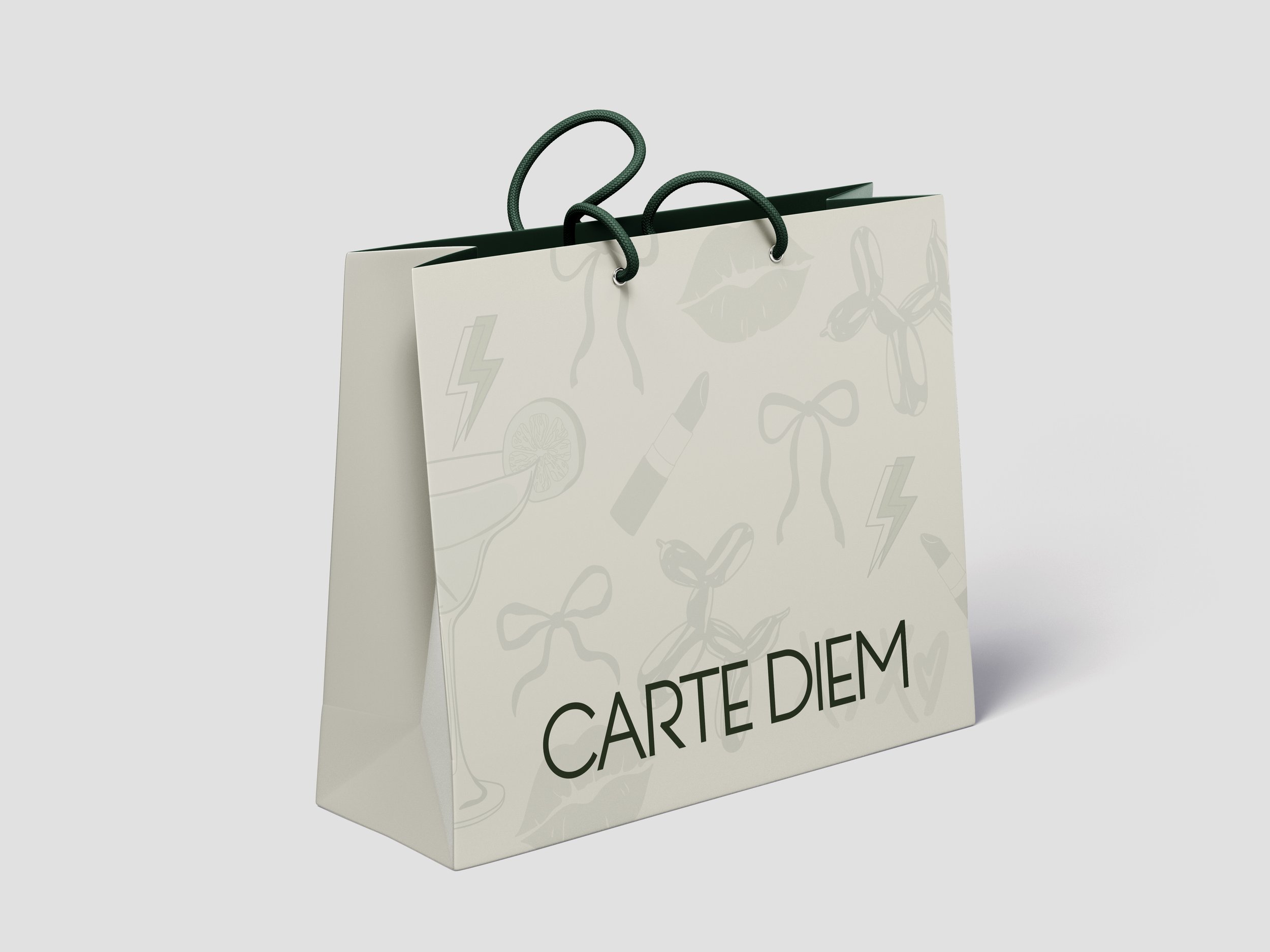
Carte Diem’s iconography is hand-illustrated and features a curated selection of feminine, everyday objects that reinforce the brand’s visual universe. Each element is designed to convey closeness, authenticity, and a playful spirit. Organic strokes and delicate details reflect a strong attention to craftsmanship and aesthetic sensitivity. More than decorative elements, these icons help build a cohesive, spontaneous visual narrative with a distinctive identity.